2 Lines
It’s a busy week, so I’m going to stick with the map of Scotland. Let’s plot a straight line between every place I’ve lived in Scotland.
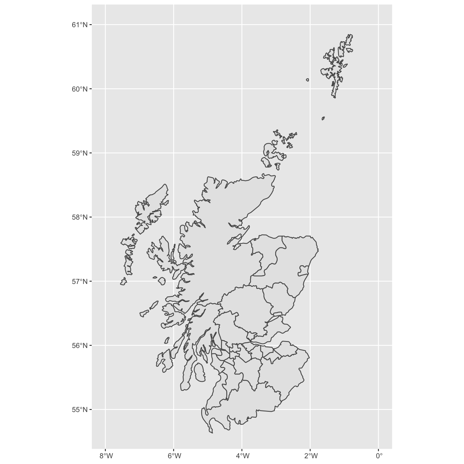
2.1 Map
First, a simple map of Scotland.

2.2 Restrict coordinates
I’m not entirely sure what’s going on with that little island around 14W/57.5N, but let’s chop it out of the plot using coord_sf().
2.3 Colours and theme
Use theme_map() from ggthemes to get rid of the latitude and longitude lines. Set the map colour and fill to “darkseagreen4” to get rid of the county lines.
Add a background colour to the plot. You can customise pretty much any part of a plot with the theme() function. The plot background is a rectangle, so you customise it using the element_rect() function, which will let you set the fill, colour, size, and linetype of the element.
Code
# set theme for all subsequent plots
theme_set(theme_map(base_size = 20))

ggplot() +
  geom_sf(data = scotland_sf,
          color = "darkseagreen4",
          fill = "darkseagreen4") +
  coord_sf(xlim = c(-8, 0), ylim = c(54.7, 61)) +
  theme(plot.background = element_rect(fill = "lightsteelblue1",
                                       color = "steelblue",
                                       size = 4))
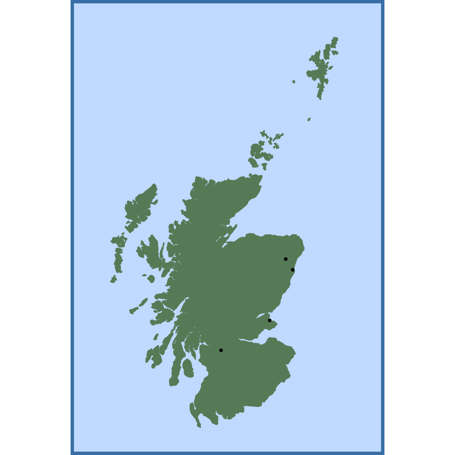
2.4 Plot where I’ve lived
I’ll make a table of the latitudes and longitudes of places I’ve lived in Scotland (just looked up on Google maps).
| name | years | lat | lon |
|---|---|---|---|
| St Andrews | 2003-2004 | 56.3398 | -2.7967 |
| Aberdeen | 2004-2009 | 57.1462 | -2.1071 |
| Oldmeldrum | 2009-2012 | 57.3167 | -2.3167 |
| Glasgow | 2012-2022 | 55.8642 | -4.2518 |
And then add it to the map with geom_point().
2.5 Add Labels
Now add labels for each location with geom_label().
Code
ggplot() +
  geom_sf(data = scotland_sf,
          color = "darkseagreen4",
          fill = "darkseagreen4") +
  coord_sf(xlim = c(-8, 0), ylim = c(54.7, 61)) +
  geom_point(aes(x = lon, y = lat), lived) +
  geom_label(aes(x = lon, y = lat, label = name, fill = years), lived) +
  theme(plot.background = element_rect(fill = "lightsteelblue1",
                                       color = "steelblue",
                                       size = 4))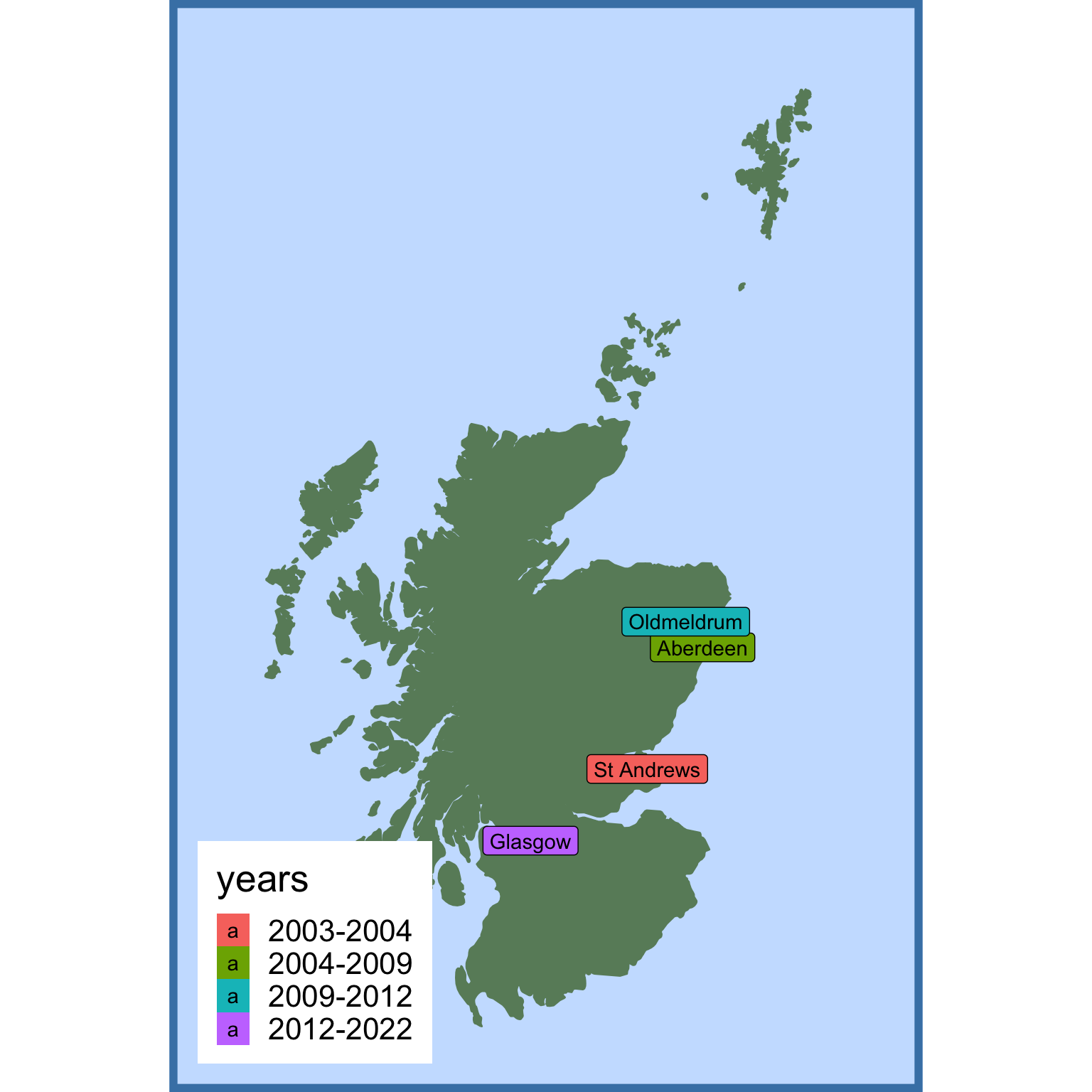
2.6 Customise legend
The legend needs a little customising, which we can do in the theme() function. If you want to get rid of an element entirely, like the legend background, use element_blank(). Setting the position to c(0, 1) puts the anchor point of the legend in the top left corner; setting the justification to c(0, 1) moved this anchor from the centre of the legend to its top left corner.
I also used scale_fill_brewer() to change to an orange palette and guides() to remove the letter a from the legend.
Code
ggplot() +
  geom_sf(data = scotland_sf,
          color = "darkseagreen4",
          fill = "darkseagreen4") +
  coord_sf(xlim = c(-8, 0.2), ylim = c(54.7, 61)) +
  geom_point(aes(x = lon, y = lat), lived) +
  geom_label(aes(x = lon, y = lat, label = name, fill = years), lived) +
  guides(fill = guide_legend(override.aes = aes(label = ""))) +
  scale_fill_brewer(palette = "Oranges") +
  theme(plot.background = element_rect(fill = "lightsteelblue1",
                                       color = "steelblue",
                                       size = 4),
        legend.position = c(0, 1),
        legend.justification = c(0, 1),
        legend.title = element_blank(),
        legend.background = element_blank())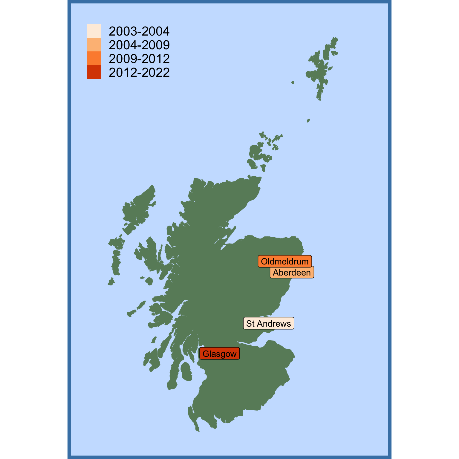
2.7 Align labels
The labels are a bit crowded, so let’s set the horizontal and vertical alignment with hjust and vjust. Alignments of 0 are left- and bottom-justified, while alignments of 1 are right- and top-justified, but you can also use decimal values.
Code
ggplot() +
  geom_sf(data = scotland_sf,
          color = "darkseagreen4",
          fill = "darkseagreen4") +
  coord_sf(xlim = c(-8, 0), ylim = c(54.7, 61)) +
  geom_point(aes(x = lon, y = lat), lived) +
  geom_label(aes(x = lon, y = lat, label = name, fill = years), lived,
             hjust = c(-.1, -.1, 1.1, 1.1),
             vjust = c(.5, .8, .2, .5)) +
  guides(fill = guide_legend(override.aes = aes(label = ""))) +
  scale_fill_brewer(palette = "Oranges") +
  theme(plot.background = element_rect(fill = "lightsteelblue1",
                                       color = "steelblue",
                                       size = 4),
        legend.position = c(0, 1),
        legend.justification = c(0, 1),
        legend.title = element_blank(),
        legend.background = element_blank())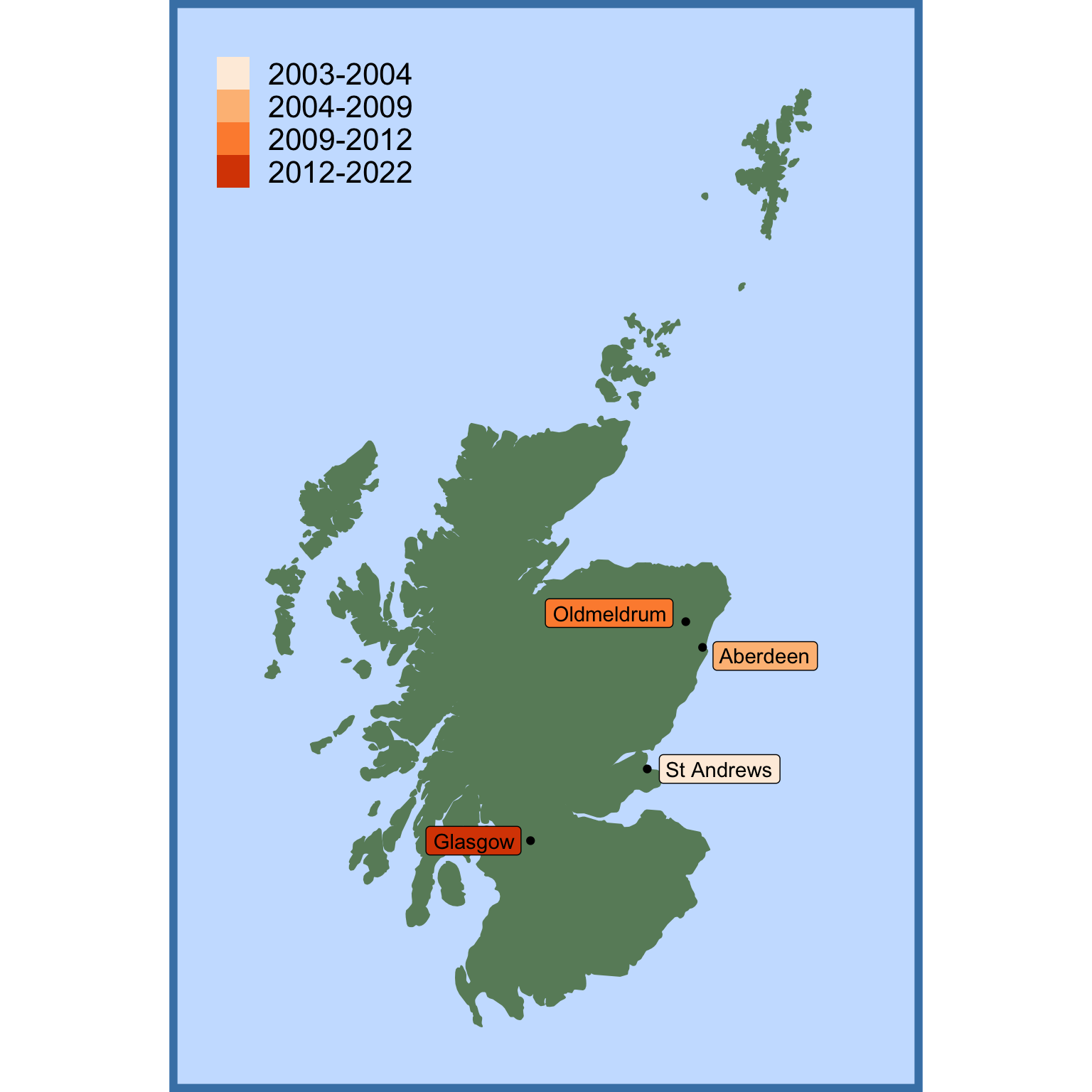
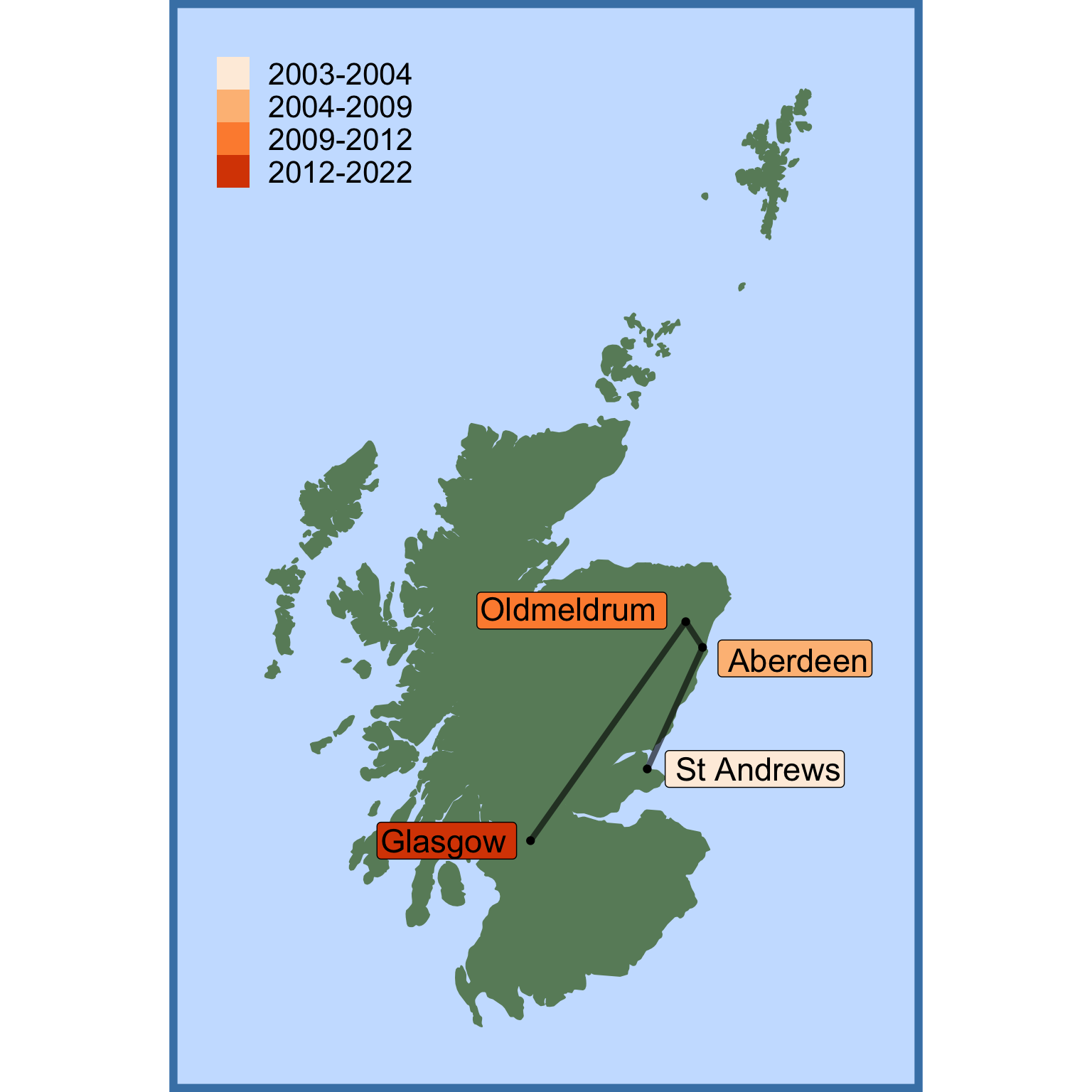
2.8 Add Lines
Finally, let’s add the line that go from each place I’ve lived in order to the next one. My first idea was to use geom_line(), but this put them in order based on x-axis value.
The labels are a bit small, so try bumping size up to 6 (this is on an arbitrary scale; not a point size like the base_size of a theme).
Code
ggplot() +
  geom_sf(data = scotland_sf,
          color = "darkseagreen4",
          fill = "darkseagreen4") +
  coord_sf(xlim = c(-8, 0), ylim = c(54.7, 61)) +
  geom_point(aes(x = lon, y = lat), lived) +
  geom_line(aes(x = lon, y = lat), lived) +
  geom_label(aes(x = lon, y = lat, label = name, fill = years), lived,
             size = 6,
             hjust = c(-.1, -.1, 1.1, 1.1),
             vjust = c(.5, .8, .2, .5)) +
  guides(fill = guide_legend(override.aes = aes(label = ""))) +
  scale_fill_brewer(palette = "Oranges") +
  theme(plot.background = element_rect(fill = "lightsteelblue1",
                                       color = "steelblue",
                                       size = 4),
        legend.position = c(0, 1),
        legend.justification = c(0, 1),
        legend.title = element_blank(),
        legend.background = element_blank())
It was actually the geom_path() function I was after, which connected the points in the order they were in my data frame. I also increased the size of the lines and decreased their alpha.
Code
ggplot() +
  geom_sf(data = scotland_sf,
          color = "darkseagreen4",
          fill = "darkseagreen4") +
  coord_sf(xlim = c(-8, 0), ylim = c(54.7, 61)) +
  geom_path(aes(x = lon, y = lat), lived, size = 1.5, alpha = 0.6) +
  geom_point(aes(x = lon, y = lat), lived) +
  geom_label(aes(x = lon, y = lat, label = name, fill = years), lived,
             size = 6,
             hjust = c(-.1, -.1, 1.1, 1.1),
             vjust = c(.5, .8, .2, .5)) +
  guides(fill = guide_legend(override.aes = aes(label = ""))) +
  scale_fill_brewer(palette = "Oranges") +
  theme(plot.background = element_rect(fill = "lightsteelblue1",
                                       color = "steelblue",
                                       size = 4),
        legend.position = c(0, 1),
        legend.justification = c(0, 1),
        legend.title = element_blank(),
        legend.background = element_blank())