2 ShinyDashboard
Shinydashboard is an R package that provides functions to upgrade the appearance and function of your Shiny apps.
2.1 Basic template for shinydashboard projects
The shinyintro package provides a basic template for a shinydashboard project.
Figure 2.1: Basic Template.App You can also access this app with shinyintro::app("basic_template")or view it in a separate tab.
You can start a new app using the template with the code shinyintro::clone("basic_template", "myapp"). This will create a new directory called myapp in your working directory and open the app.R file in RStudio.
This directory contains:
-
app.R: the file where you define the ui and server -
DESCRIPTION: A file that contains some structured info about the app -
README.md: A file that can contain any information you want -
scripts: a directory that can contain external R code that you can source into theapp.Rfile -
www: a directory that contains helper files like images, CSS, and JavaScript
2.2 Dashboard Structure
Notice that the ui is created with dashboardPage() now. This needs to be set up a little differently than fluidPage(). The main parts of a dashboard page are the header, sidebar, and body.
You can also change the default skin colour. Possible skin colours are: "red", "yellow" (looks orange to me), "green", "blue", "purple", and "black".
dashboardPage(skin = "purple",
              dashboardHeader(),
              dashboardSidebar(),
              dashboardBody())
2.2.1 dashboardHeader
You can add a title to the header, and change the title width.
dashboardHeader(title = "Basic Template",
                # puts sidebar toggle on right
                titleWidth = "calc(100% - 44px)")
You can also include message, notification, and task menus in the header. We won't be using those in this class, but you can learn more at the shinydashboard site.
If you don't want to use a header, include dashboardHeader(disable = TRUE) inside dashboardPage().
2.2.3 dashboardBody
The main part of the app goes inside dashboardBody() If you're going to use javascript functions (which the basic template does and we'll learn more about in Section 7.3.1), you need to put useShinyjs() first. Then you include the head, linking to any custom CSS or JavaScript files.
The contents of the body go after that. The most common pattern is a multi-page tabbed pattern, which is set up with tabItems(), containing a tabItem() for each tab. The tabName has to match the name you used in the sidebar menuItem(), so that tab shows when the user clicks on the corresponding menu item.
dashboardBody(
  shinyjs::useShinyjs(),
  tags$head(
    # links to files in www/
    tags$link(rel = "stylesheet",
              type = "text/css",
              href = "custom.css"),
    tags$script(src = "custom.js")
  ),
  tabItems(
    tabItem(tabName = "demo_tab",
            imageOutput("logo"))
  )
)
Since each tab is usually a quite complex list of elements, I like to define each tab outside dashboardPage() and then just put a list of the tab objects inside tabItems(). This way, it's easy to move the whole tab definition to an external file if it gets too complex (see Section 8).
2.3 Body Structure
Tab items can be structured in several ways. At the simplest, you can just list each element after the tabName.
tabItem(
  tabName = "demo_tab",
  textInput("given", "Given Name"),
  textInput("surname", "Surname"),
  selectInput("pet", "What is your favourite pet?",
              c("cats", "dogs", "ferrets")),
  textAreaInput("bio", NULL,
                height = "100px",
                placeholder = "brief bio")
)
2.3.1 Boxes
Most shinydashboard apps organise the parts inside boxes.
tabItem(tabName = "demo_tab",
        box(
          textInput("given", "Given Name"),
          textInput("surname", "Surname"),
          selectInput("pet", "What is your favourite pet?",
                      c("cats", "dogs", "ferrets"))
        ),
        box(
          textAreaInput("bio", NULL,
                        height = "100px",
                        placeholder = "brief bio")
        ))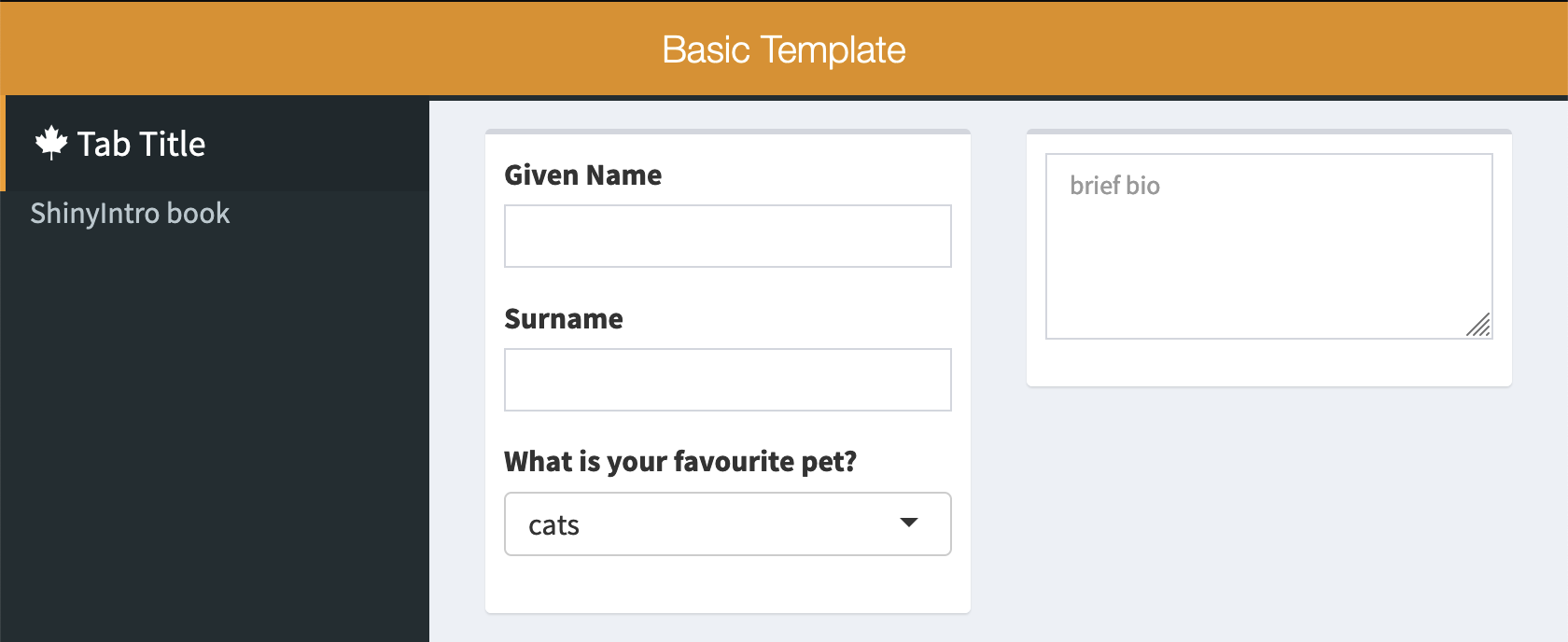
Figure 2.2: Organizing elements inside boxes.
You can add titles to the boxes, make them collapsible and/or give them solid headers.
tabItem(
    tabName = "demo_tab",
    box(title = "Personal Info",
        collapsible = TRUE,
        textInput("given", "Given Name"),
        textInput("surname", "Surname"),
        selectInput("pet", "What is your favourite pet?", c("cats", "dogs", "ferrets"))
    ),
    box(title = "Biography",
        solidHeader = TRUE,
        textAreaInput("bio", NULL, height = "100px", placeholder = "brief bio")
    )
)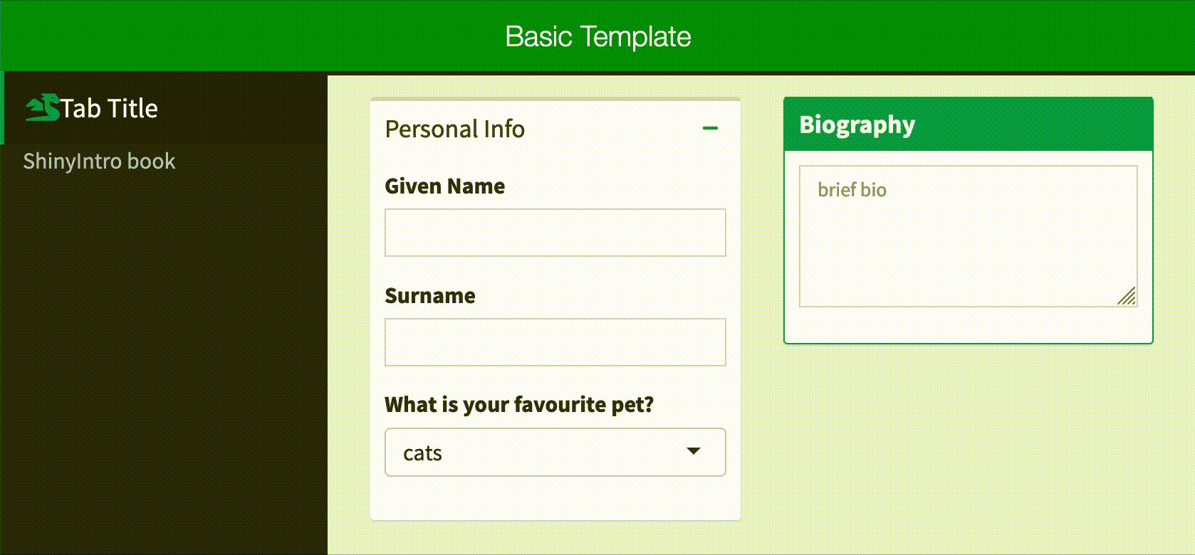
In the normal shinydashboard style, solid headers only have a colour if the box also has the status argument set. In the basic template provided in this class, there is custom CSS to make solid headers the same colour as the theme skin, but you can also set the status.
tabItem(
    tabName = "demo_tab",
    box(title = "No Status", solidHeader = TRUE),
    box(title = "Primary",   solidHeader = TRUE, status = "primary"),
    box(title = "Success",   solidHeader = TRUE, status = "success"),
    box(title = "Info",      solidHeader = TRUE, status = "info"),
    box(title = "Warning",   solidHeader = TRUE, status = "warning"),
    box(title = "Danger",    solidHeader = TRUE, status = "danger")
)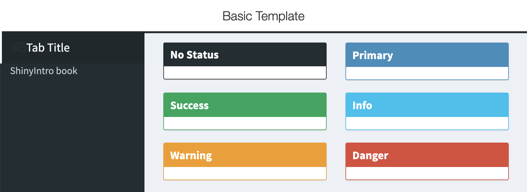
Figure 2.3: Shinydashboard Box Statuses.
2.3.2 Info and Value Boxes
You can use an infoBox() or a valueBox() to highlight a small amount of information. The default background is aqua, but the basic template changes this to the skin colour. However, you can customise this by setting the color argument.
tabItem(
    tabName = "demo_tab",
    infoBox("Default InfoBox", "Value", "Subtitle"),
    valueBox("Default ValueBox", "With subtitle"),
    valueBox("No subtitle", "")
)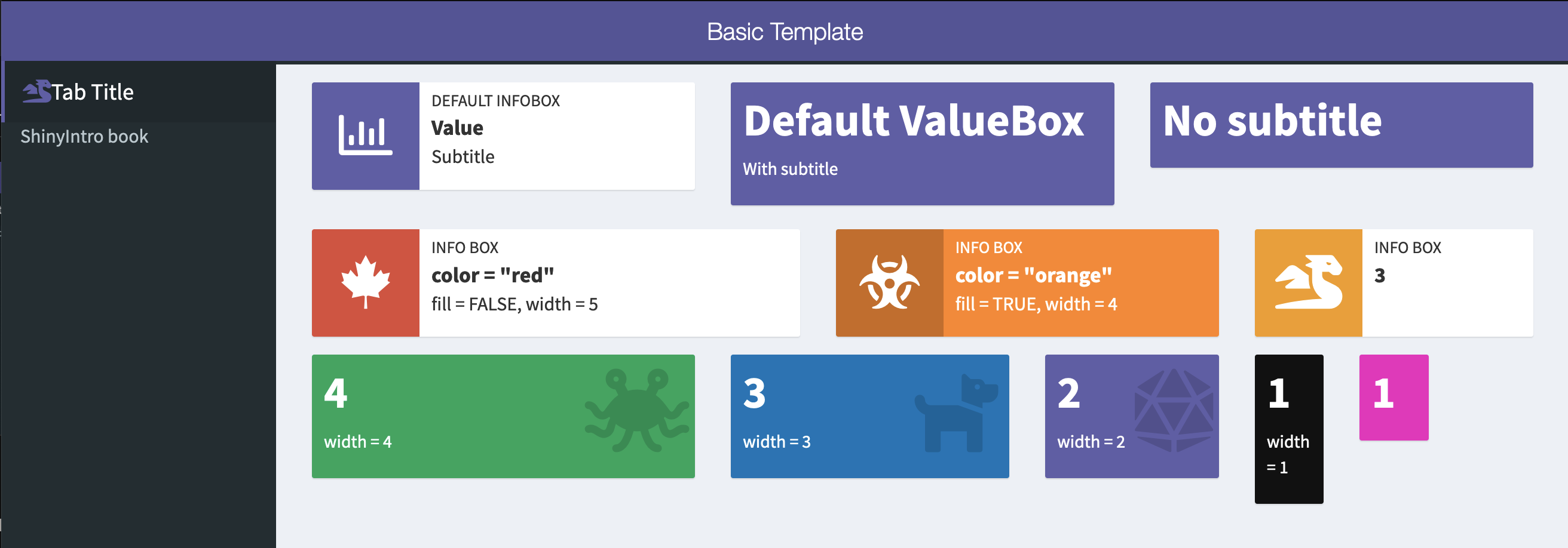
Figure 2.4: Examples of value and info boxes you can make.
Shinydashboard uses a grid system that is 12 units across. The default width of boxes is 6, and info and value boxes are 4.
Try to write the code to create the second row of info boxes shown above and the third row of value boxes.
2.3.3 Tab Boxes
Create a box with multiple tabs using tabBox(), which contains tabPanel().
tabItem(
    tabName = "demo_tab",
    tabBox(
        title = "Test Yourself 1",
        tabPanel("Question", "What function creates tabBox contents?"),
        tabPanel("Answer", "tabPanel()")
    ),
    tabBox(
        title = "Test Yourself 2",
        side = "right",
        selected = "Question",
        tabPanel("Answer", "selected"),
        tabPanel("Question", "What attribute changes the default tab?")
    )
)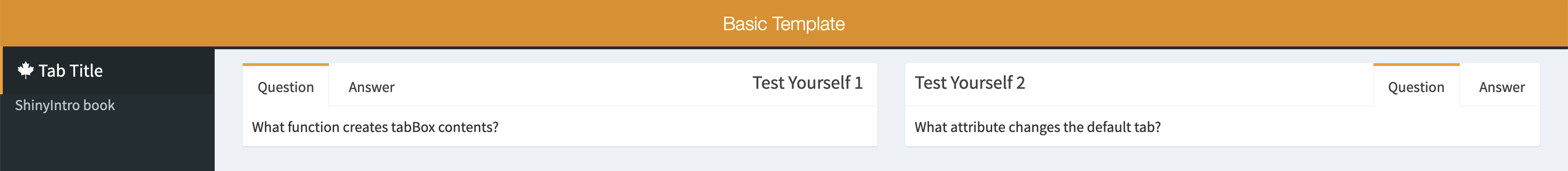
Figure 2.5: Tab Boxes
2.3.4 Row Layout
You can arrange the boxes inside a fluidRow(). Set the box height in pixels. If the window gets too narrow, the boxes will move to stack instead of be in rows.
tabItem(
    tabName = "demo_tab",
    fluidRow(
      box("A", title = "2x100", width = 2, height = 100),
      box("B", title = "1x100", width = 1, height = 100),
      box("C", title = "2x200", width = 2, height = 200),
      box("D", title = "3x300", width = 3, height = 300),
      box("E", title = "4x100", width = 4, height = 100),
      box("F", title = "5x100", width = 5, height = 100),
      box("G", title = "7x100", width = 7, height = 100)
    )
)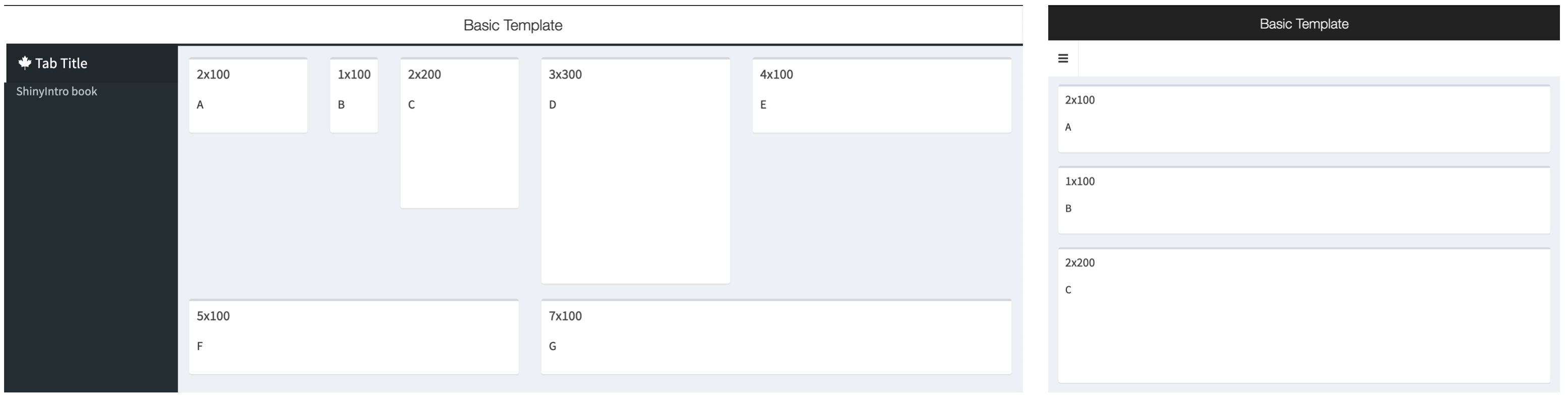
Figure 2.6: An example fluidRow layout of boxes with different widths and heights.
2.3.5 Column Layout
Alternatively, you can arrange boxes or other elements inside a column() with a specific width. Elements inside this column have a width relative to the column width, so no matter what value you set the column width to, an element inside with a width of 6 will be half the column width.
tabItem(
    tabName = "demo_tab",
    column(width = 6,
        box("A", title = "12x100", width = 12, height = 100),
        box("B", title = "6x100", width = 6, height = 100),
        box("C", title = "6x200", width = 6, height = 200)
    ),
    column(width = 4,
        box("D", title = "12x300", width = 12, height = 300),
        box("E", title = "12x100", width = 12, height = 100)
    ),
    column(width = 2,
        box("F", title = "12x100", width = 12, height = 100),
        box("G", title = "12x100", width = 12, height = 100)
    )
)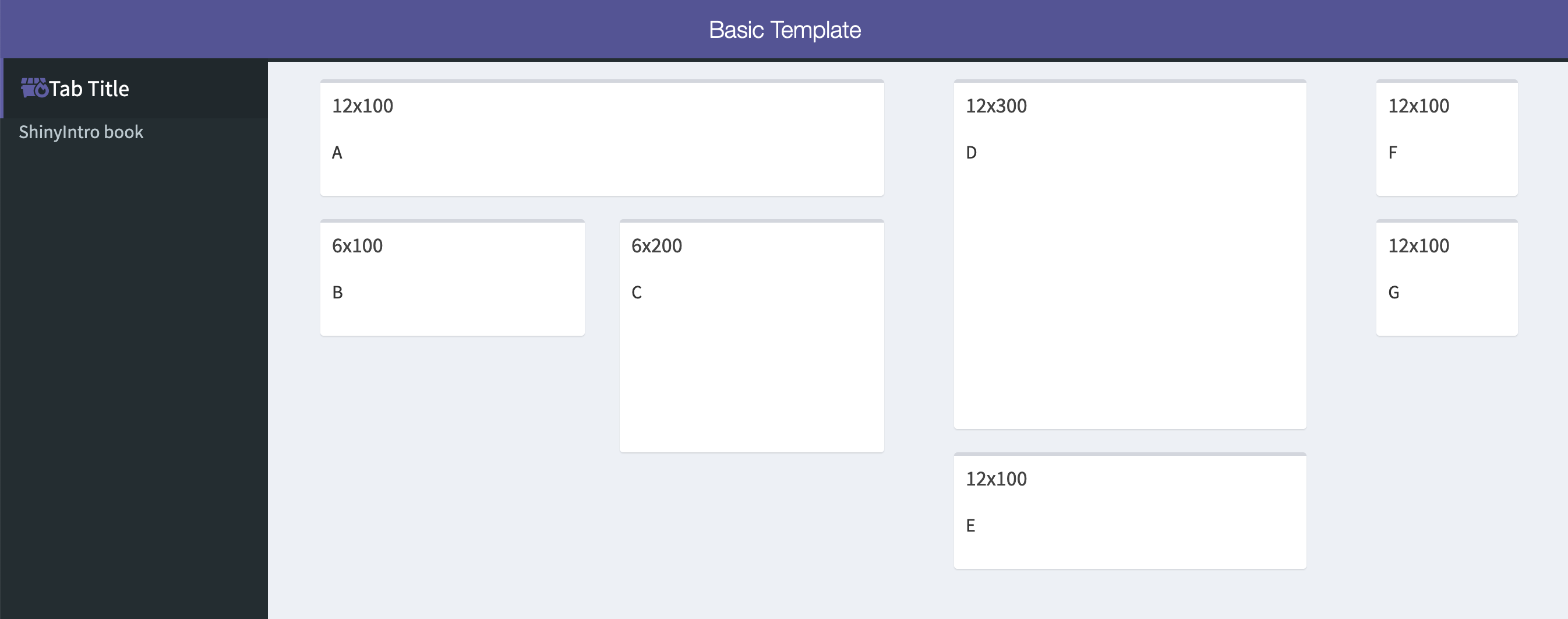
Figure 2.7: An example for column layout.
2.5 Your App
2.5.1 Create an app from the basic template
- Create a demo app from the basic template and run it.
- Close the app and run it again.
- Look at the code to see how the theme colour and sidebar icon change.
- Change the title and author in the
DESCRIPTIONfile and set DisplayMode to "Showcase" instead of "Normal" to see what happens when you run it.
2.5.2 Customize the header
- Change the
titleto the title of the app you want to build. - Choose a
skincolor. - Experiment with different values for the
titleWidthargument. Try"50%"or"200px"and see how the title behaves when you change the width of the browser window.
2.5.4 Customize the body
- Create an empty
tabItem()for each tab you put in thesidebarMenu()and add them to thedashboardBody(). - Start adding elements to each tab, such as a list of inputs with questions or a
plotOutput()to display a feedback plot. - Experiment with different ways to display the elements by grouping them into boxes
- Experiment with different layouts for your boxes and elements.
- Make sure you check how the app looks on different sized screens, such as phone screens.