library(tidyverse) # for data wrangling and visualisationlibrary(sf) # for mapslibrary(rnaturalearth) # for map coordinateslibrary(gganimate) # for animated plotslibrary(transformr) # for animated mapslibrary(gifski) # for more efficient gif creationlibrary(ggthemes) # for map themelibrary(lwgeom) # for map projectionlibrary(showtext) # for adding fonts# add the playfair font for the plot titlefont_add_google(name ="Playfair Display", family ="Playfair Display")# font_add(family = "Playfair Display",# regular = "~/Library/Fonts/PlayfairDisplay-VariableFont_wght.ttf")showtext_auto()
I hate working with columns that have uppercase letters or spaces in the names, so I adjusted the column names when importing. I also found out later that this dataset labels South Sudan as “SSD”, but the data from sf labels it as “SDS”, so I’ll fix it here.
Load data
# data from https://ourworldindata.org/technology-adoptiondata_orig <-read_csv("data/share-of-individuals-using-the-internet.csv",col_names =c("country", "code", "year", "it_net_users"),skip =1, show_col_types =FALSE) %>%mutate(code =recode(code, SSD ="SDS", .default = code))
There are a lot of missing years. I want them in the map explicitly as rows with it_net_users == NA, for reasons that will get clear later. Pivot wider, which will create a column for each year with NA as the value for any countries that don’t have a row for that year, then pivot back longer.
Here’s a better projection. You have to use the st_transform_proj() function from lwgeom to transform the coordinates. You need to add coord_sf(datum = NULL) to the plots to avoid an error message when sf tries to plot the graticule. I also cropped the coordinates to remove giant Antarctica and centre the continents better.
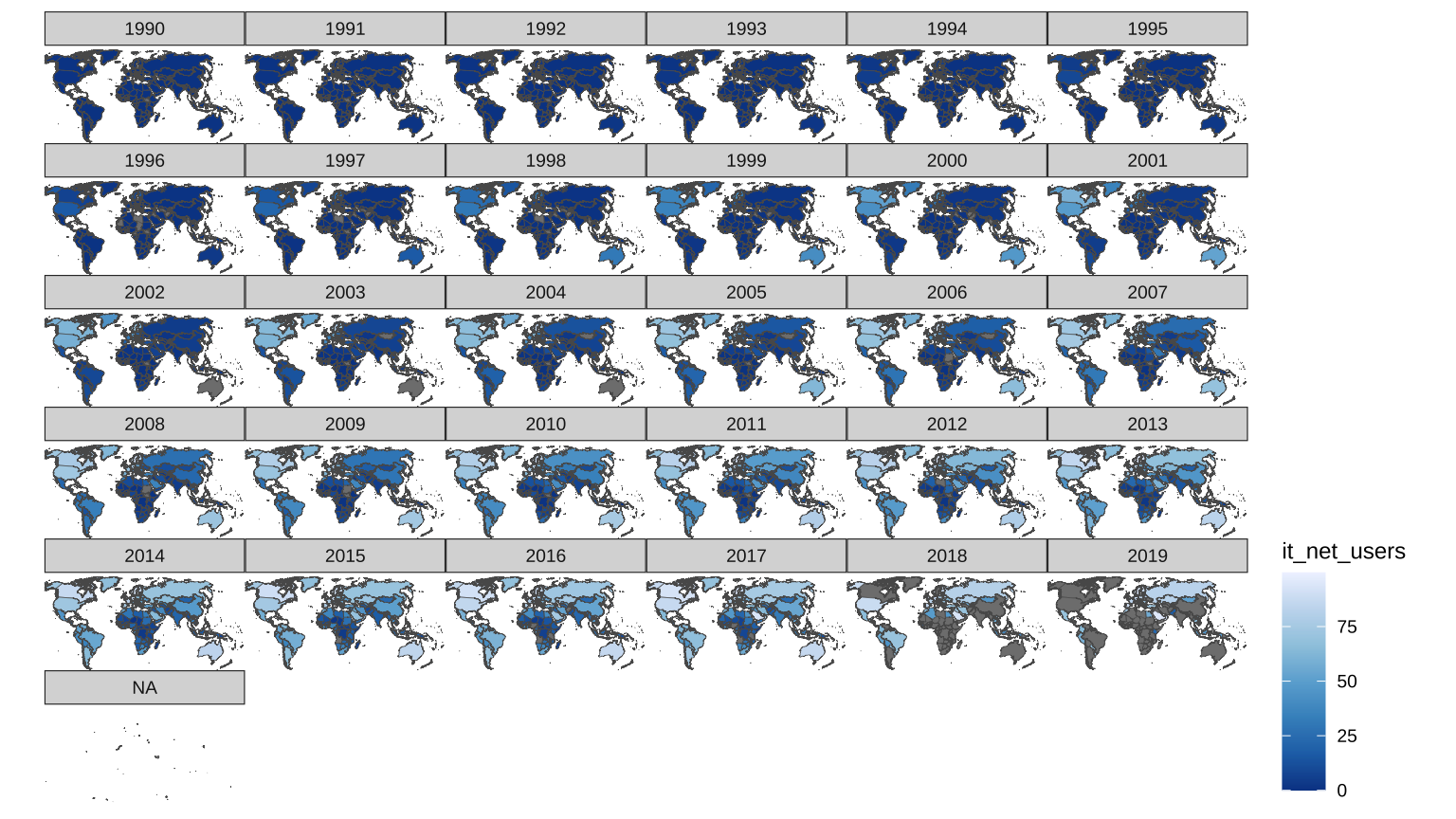
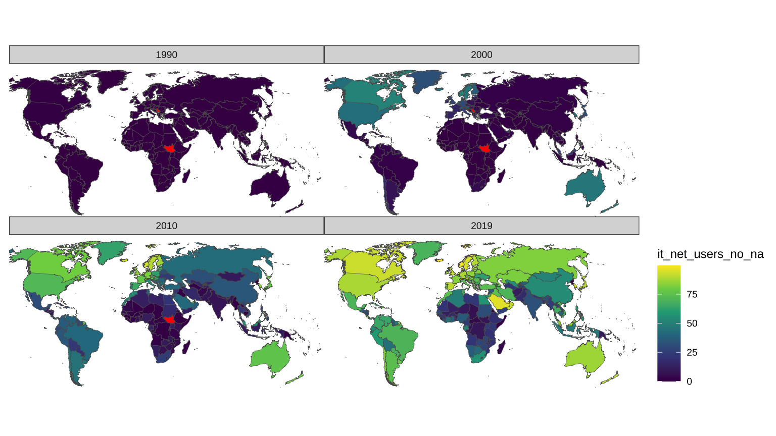
Where is the NA facet coming from? It must be regions that never have any data. I’ll group by country and omit any that are entirely NA.
Code
# get data for countries with at least one valid yeardata_map_int_valid <- data_map_int %>%group_by(country) %>%filter(!all(is.na(year))) %>%ungroup()
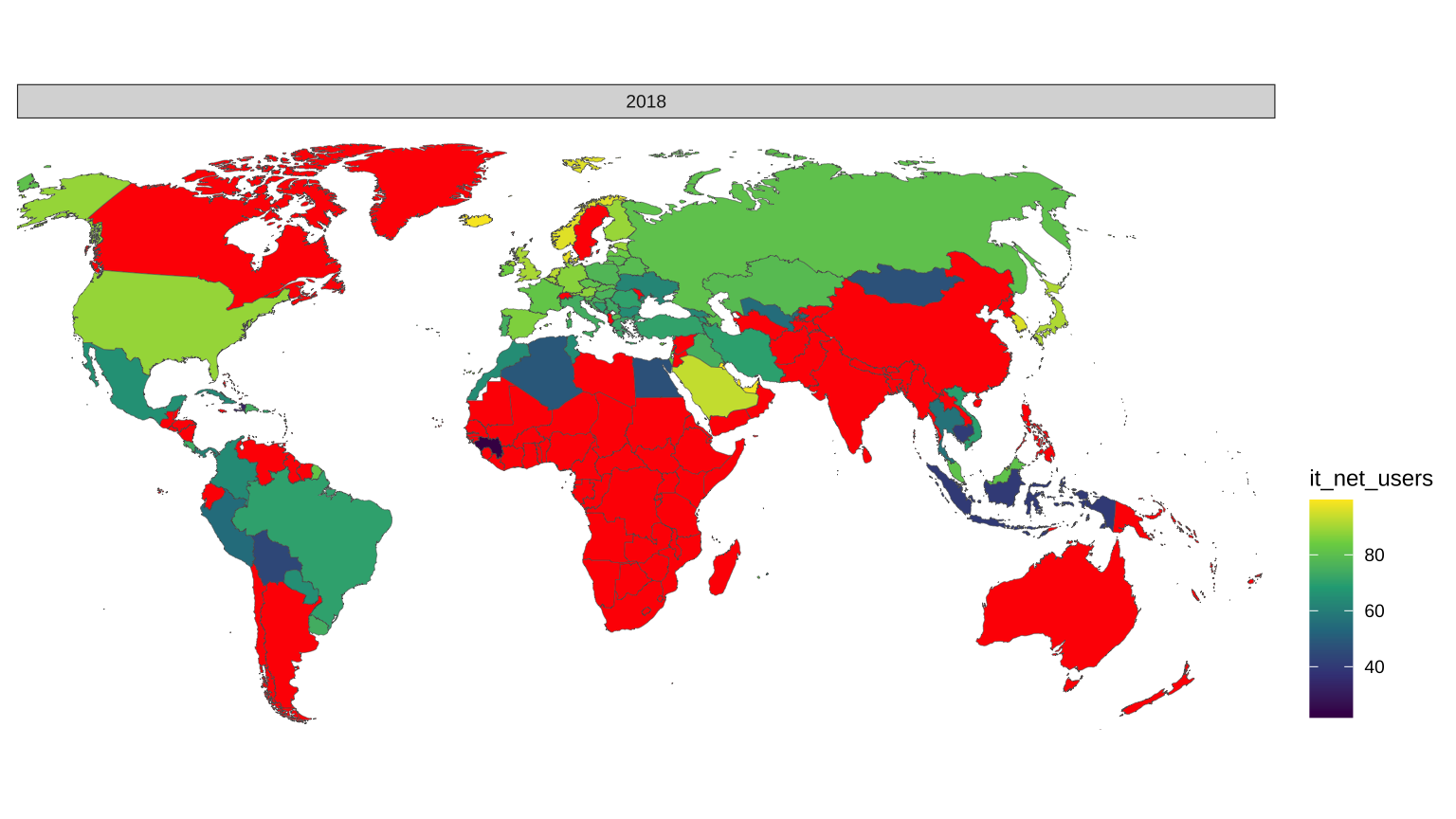
Now let’s retry the map, and switch the fill to a nicer viridis gradient. Set the na.value to red to more easily see where the missing data is. Just plot 2018 to check.
We don’t have data for a lot of countries in some years. I’m going to use the previous year’s data where there is missing data. I’ll also add a column for whether or not it’s a filled value so I can indicate this on the map if I want.
South Sudan got independence from Sudan in 2011, so lets fill in the values for South Sudan from 1990 to 2012 using the values from Sudan. I found it weirdly hard to do this, and would appreciate if someone could show me a tidier way. Also, I’m sure it will come back to bite me, but I’ve named this data table data_map_int_final.
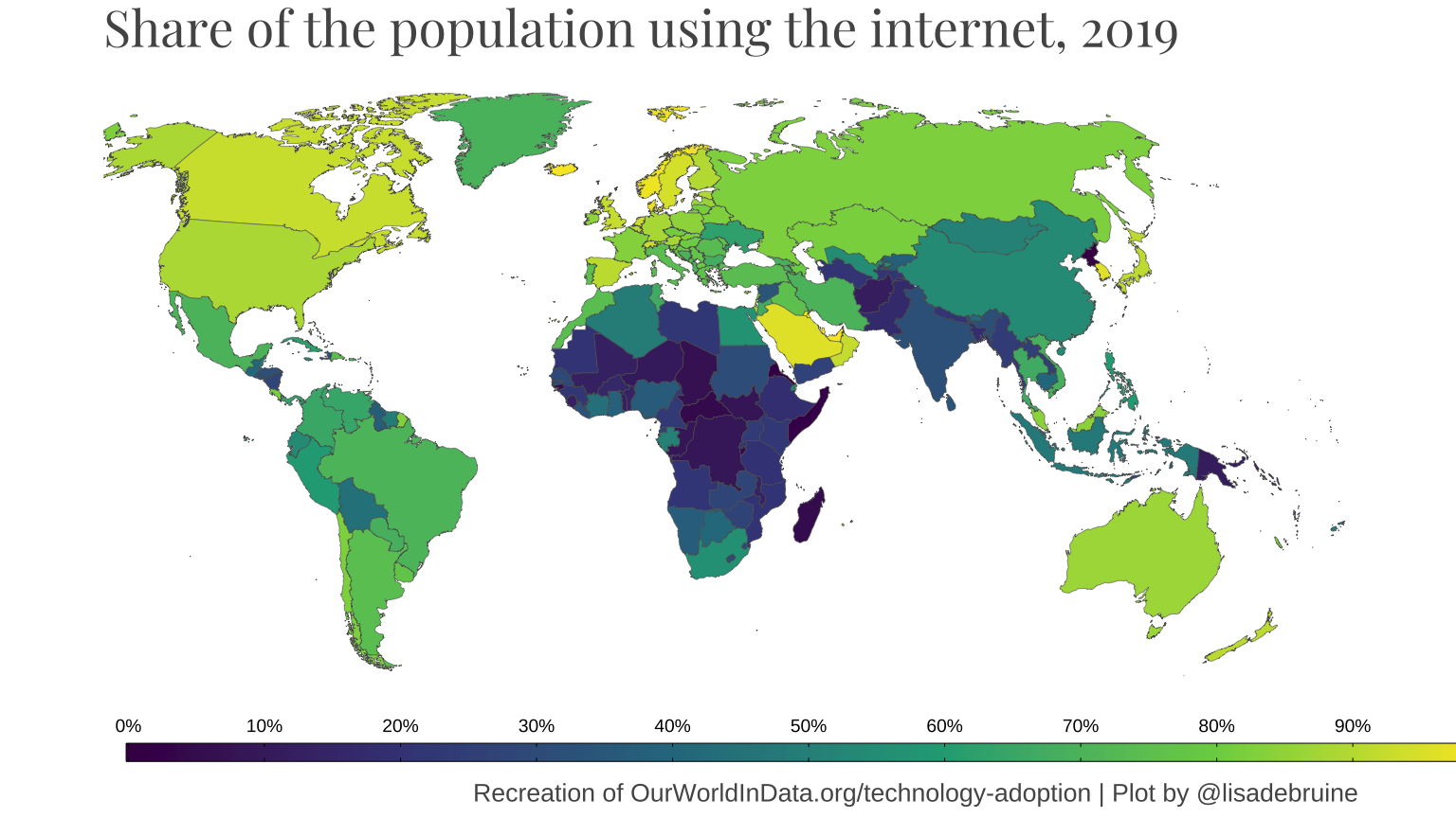
Now I want to set up what a single frame will look like in my animation. I’ll filter the data down to the year 2019 and work on the plot until I’m happy.
Code
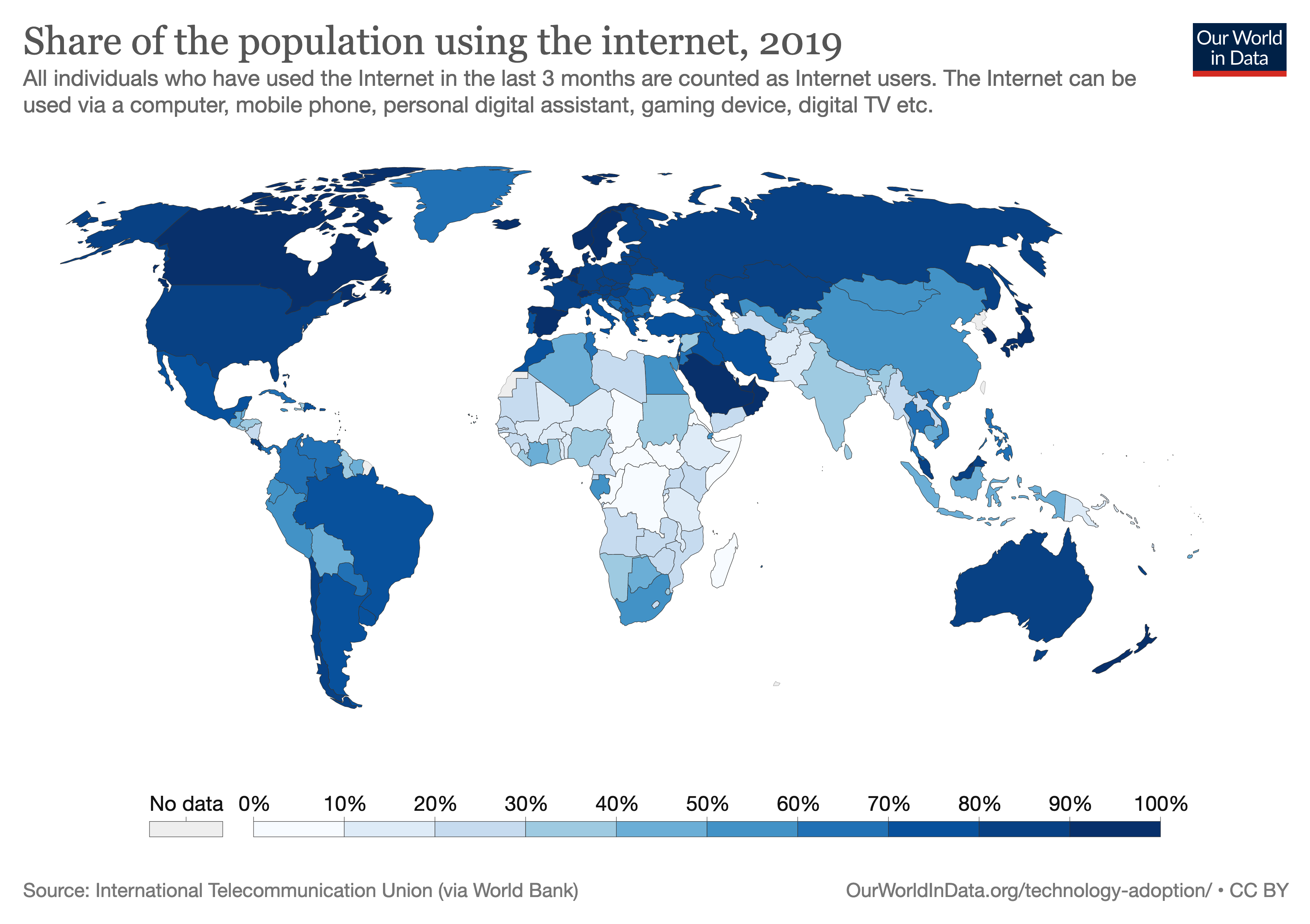
ggplot(filter(data_map_int_final, year ==2019)) +geom_sf(mapping =aes(fill = it_net_users_no_na/100),size =0.1) + crop_coords +scale_fill_viridis_c(name =NULL,limits =c(0, 1),breaks =seq(0, 1, .1),labels =function(x)scales::percent(x, accuracy =1),guide =guide_colorbar(label.position ="top", barheight =unit(.1, "in"),frame.colour ="black",ticks.colour ="black" ) ) +labs(title ="Share of the population using the internet, 2019",caption ="Recreation of OurWorldInData.org/technology-adoption | Plot by @lisadebruine") +theme_map() +theme(legend.background =element_blank(),legend.position ="bottom",legend.key.width =unit(1.5, "inches"),plot.title =element_text(family ="Playfair Display", size =20, colour ="#555555"),plot.caption =element_text(size =10, color ="#555555") )
6.8 Animated plot
Code
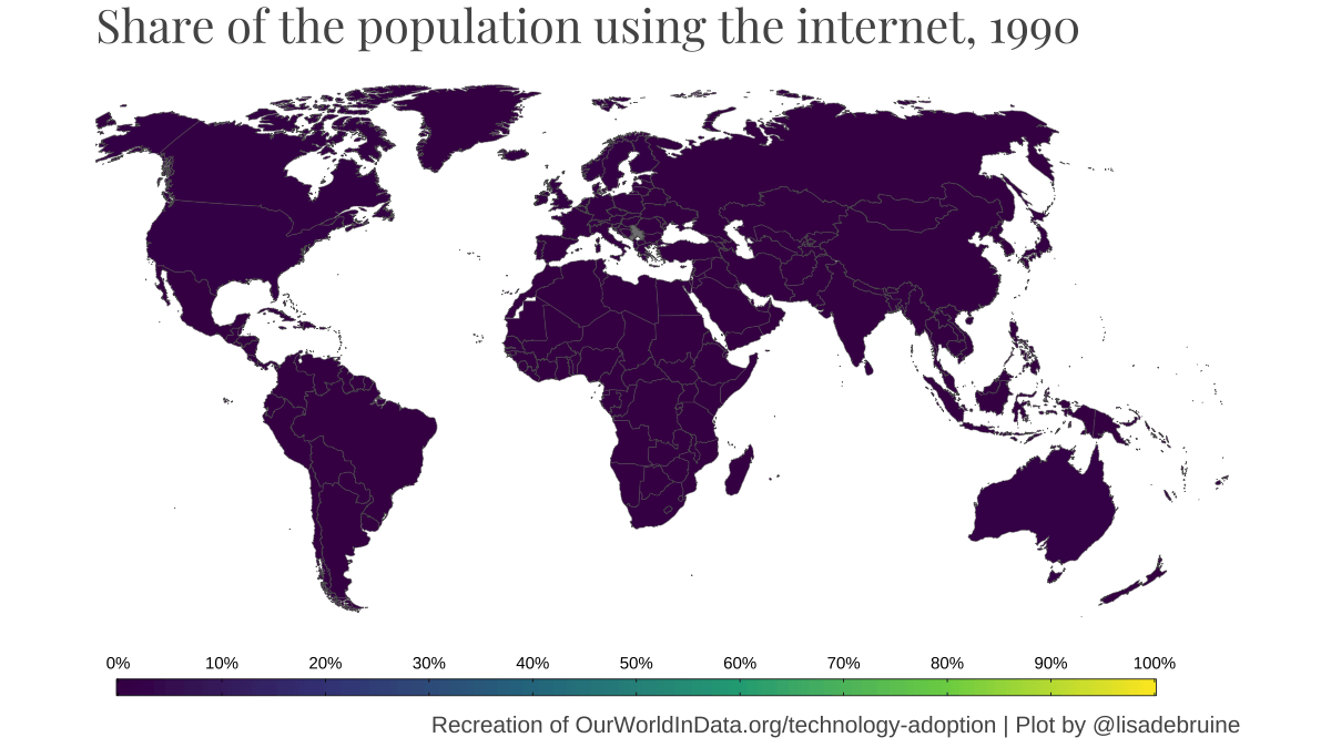
anim <-ggplot(data_map_int_final) +geom_sf(mapping =aes(fill = it_net_users_no_na/100),size =0.1) + crop_coords +scale_fill_viridis_c(name =NULL,limits =c(0, 1),breaks =seq(0, 1, .1),labels =function(x)scales::percent(x, accuracy =1),guide =guide_colorbar(label.position ="top", barheight =unit(.1, "in"),frame.colour ="black",ticks.colour ="black" ) ) +labs(title ="Share of the population using the internet, {frame_time}",caption ="Recreation of OurWorldInData.org/technology-adoption | Plot by @lisadebruine") +theme_map() +theme(legend.background =element_blank(),legend.position ="bottom",legend.key.width =unit(1.25, "inches"),plot.title =element_text(family ="Playfair Display", size =20, colour ="#555555"),plot.caption =element_text(size =10, color ="#555555") ) +transition_time(year)
It takes absolutely forever to create the animation (I think because it’s unnecessarily tweening the shapes, but I don’t have time to learn more about gganimate today), so run this once and set the code chunk to eval = FALSE and load the gif from file.
Code
anim_save("images/day6.gif", animation = anim, nframes =30, fps =4, start_pause =6, end_pause =6, width =8, height =4.5, units ="in", res =150)