I wrote faux to make it easier to simulate multivariate normal distribution data with different patterns of correlations, because I was doing it manually using mvrnorm() so often. It’s expanded to a whole package dedicated to making simulation easier, focusing on simulation from the kinds of parameters you might find in the descriptives table of a paper.
I’ll be using the new NORTA (NORmal-To-Anything) methods for today’s chart, which are currently only in the development version of faux, so you need to download the GitHub version, not 1.1.0 on CRAN. You can see a tutorial here.
Setup
# devtools::install_github("debruine/faux")# devtools::install_github("debruine/webmorphR")library(faux) # for data simulationlibrary(ggplot2) # for plottinglibrary(ggExtra) # for margin plotslibrary(patchwork) # for combining plotslibrary(webmorphR) # for figure making from imagestheme_set(theme_minimal(base_size =14))
15.1 Simulate data
The rmulti() function uses simulation to determine what correlations among normally distributed variables is equivalent to the specified correlations among non-normally distributed variables, then simulates correlated data from a multivariate normal distribution and converts it to the specified distributions using quantile functions.
It works pretty much like rnorm_multi(), with the addition of a dist argument where you can set the distribution and a params argument where you can set their parameters.
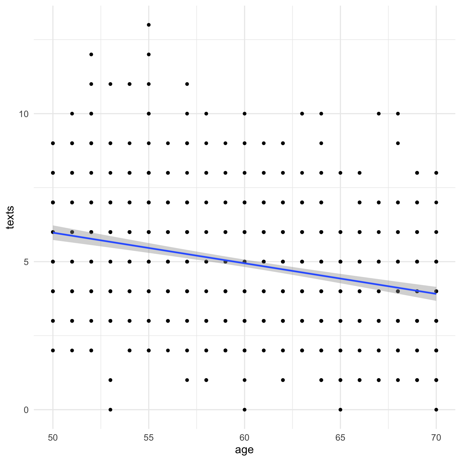
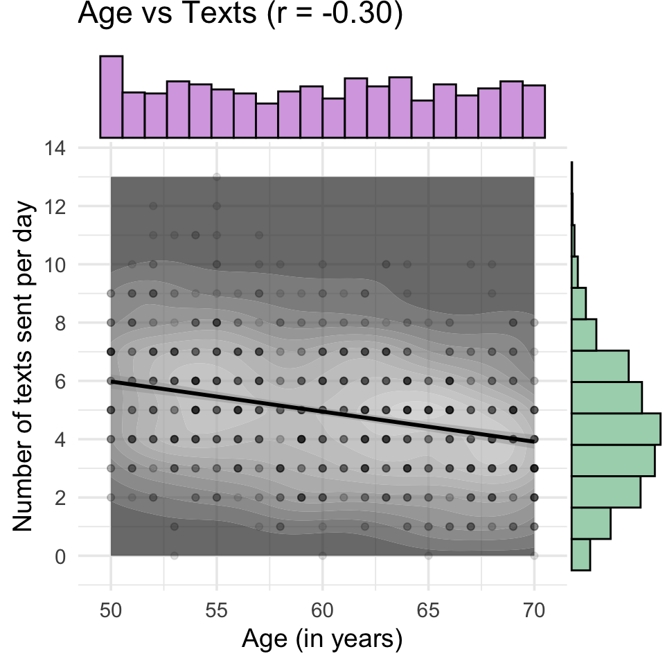
The code below simulates 1000 people with uniformly distributed age between 50 and 70, and the number of texts they send per day, which we’ll simulated with a Poisson distribution with a mean (lambda) of 5. They’re given a questionnaire with 1-7 Likert ratings, which are averaged, so the resulting scores are truncated from 1 to 7, with a mean of 3.5 and SS of 2.1. Age and texts are negatively correlated with \(r =-0.3\). Age is also negatively related to the score, \(r = -.4\), while score and texts are positively correlated \(r = 0.5\).
Code
set.seed(8675309) # for reproducibilitydat <-rmulti(n =1000, dist =c(age ="unif",texts ="pois",score ="truncnorm"),params =list(age =c(min =50, max =70),texts =c(lambda =5),score =c(a =1, b =7, mean =3.5, sd =2.1) ),r =c(-0.3, -0.4, +.5))check_sim_stats(dat)
n
var
age
texts
score
mean
sd
1000
age
1.00
-0.30
-0.42
60.28
5.76
1000
texts
-0.30
1.00
0.45
4.92
2.10
1000
score
-0.42
0.45
1.00
3.74
1.53
15.2 Plot individual distributions
15.2.1 Age
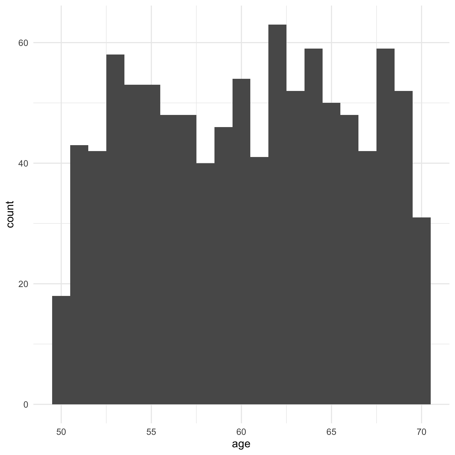
Age is uniformly distributed from 50 to 70, so a histogram is probably most appropriate here. Why is the default histogram so ugly?
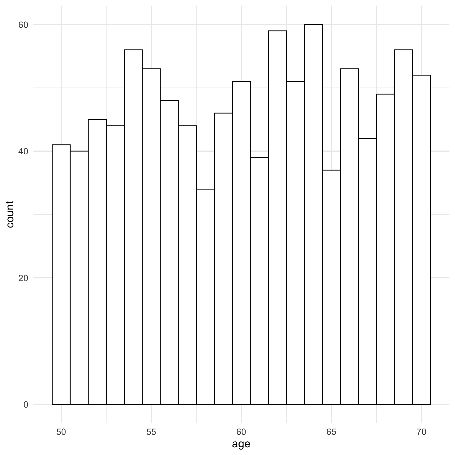
Oops, I forgot that the uniform distribution is continuous and we normally think of age in integers. There are about half as many 50 and 70 year olds than the other ages. You can fix that by simulating age from 50.501 to 70.499 (I can never remember which way exact .5s round, so I just make sure they won’t round to 49 or 71.)
Code
set.seed(8675309) # for reproducibilitydat <-rmulti(n =1000, dist =c(age ="unif",texts ="pois",score ="truncnorm"),params =list(age =c(min =50- .499, max =70+ .499),texts =c(lambda =5),score =c(a =1, b =7, mean =3.5, sd =2.1) ),r =c(-0.3, -0.4, +.5))dat$age <-round(dat$age)
I’ll also fix the histogram style.
Code
ggplot(dat, aes(x = age)) +geom_histogram(binwidth =1, fill ="white", color ="black")
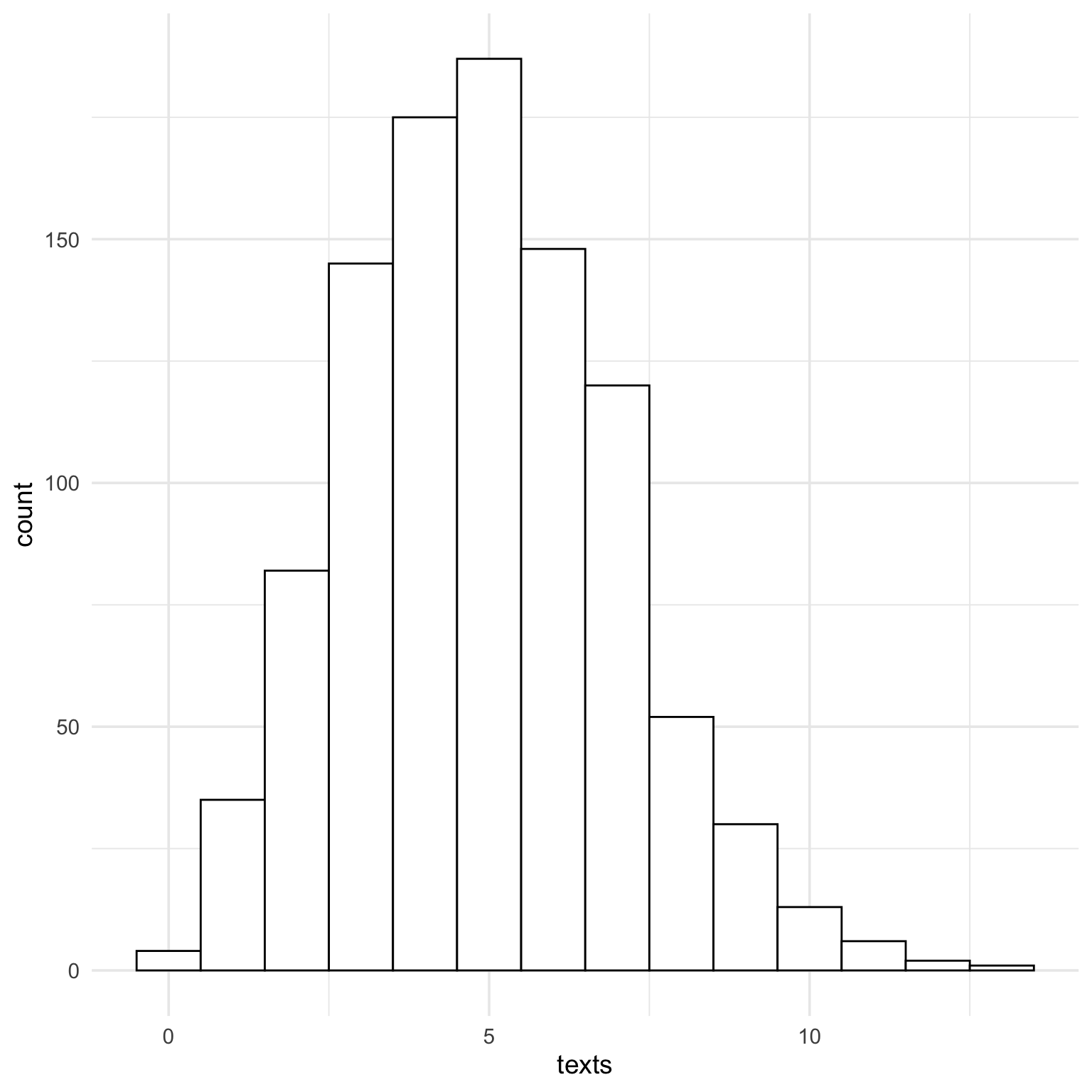
15.2.2 Texts - Poisson
The Poisson distribution approaches the normal when lambda gets large, which is why I set the example to a low number of texts.
Code
ggplot(dat, aes(x = texts)) +geom_histogram(binwidth =1, fill ="white", color ="black")
15.2.3 Score
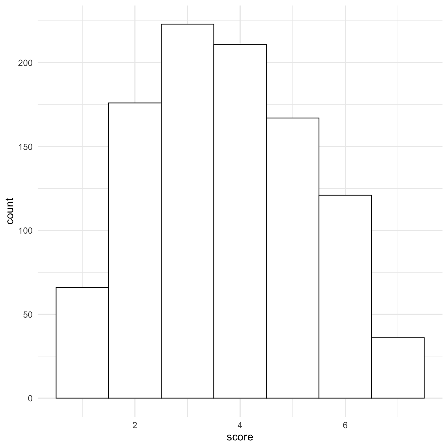
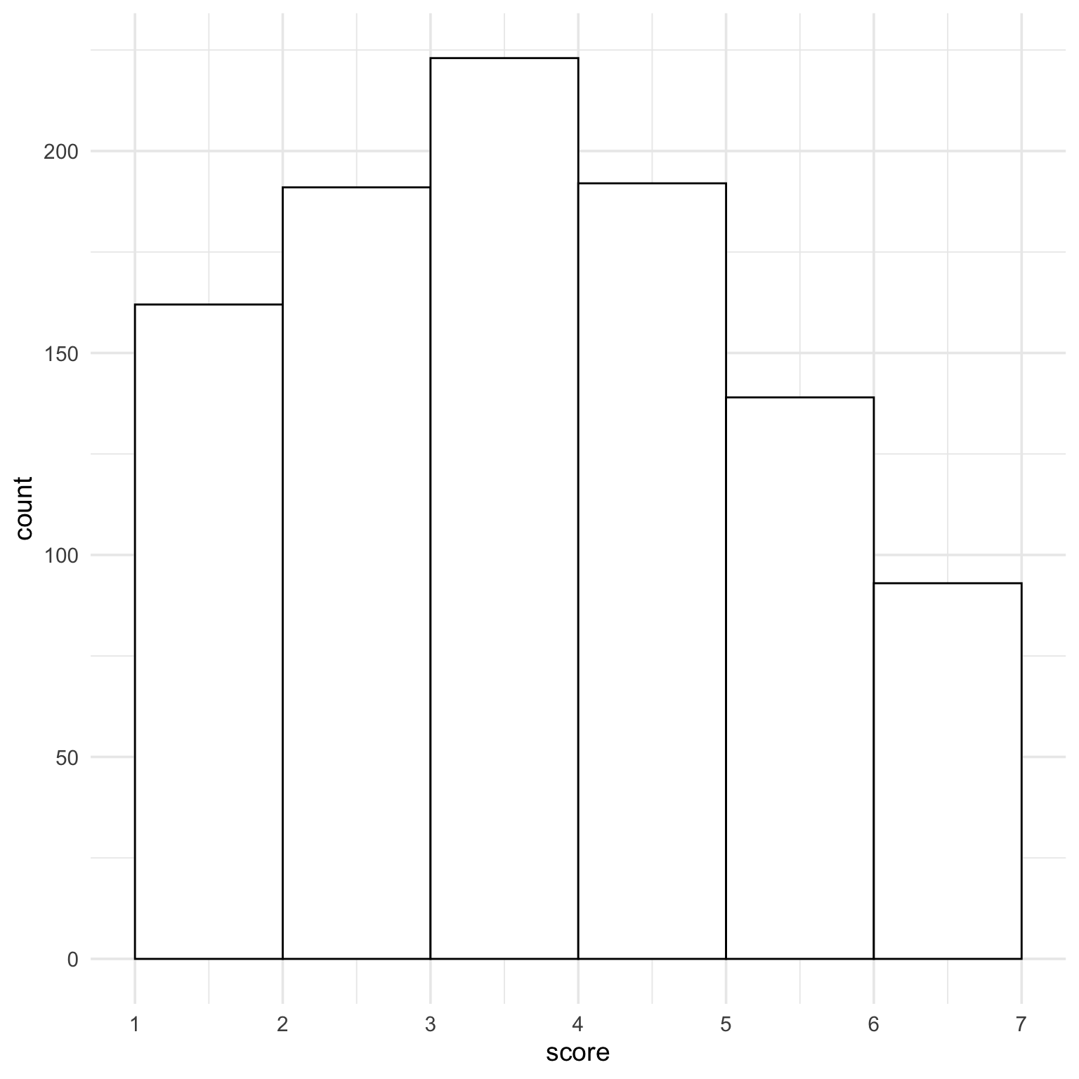
The truncated normal distribution for our score has a minimum value of 1 and a maximum value of 7.
Code
ggplot(dat, aes(x = score)) +geom_histogram(binwidth =1, fill ="white", color ="black")
The default histogram isn’t great for this. The first column is scores between 0.5 and 1.5, and half of those are impossible scores. Set the histogram boundary to 1 to and x-axis breaks to 1:7 to fix this. Now each bar is the number of people with scores between the breaks.
Code
ggplot(dat, aes(x = score)) +geom_histogram(binwidth =1, boundary =1, fill ="white", color ="black") +scale_x_continuous(breaks =1:7)
15.3 Plot bivariate distributions
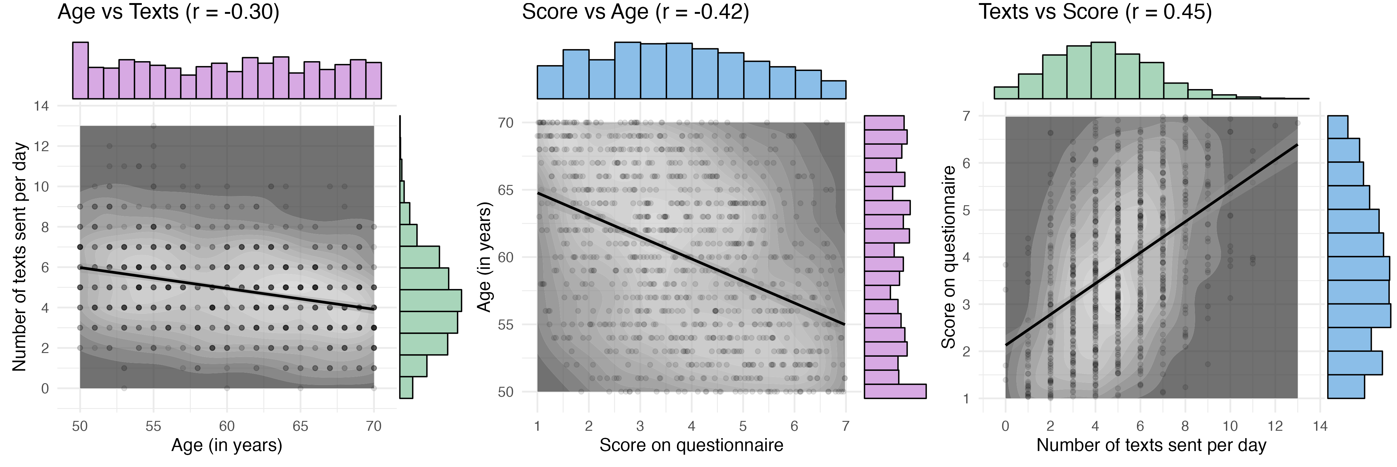
Now that we have a bit of a handle on the data, we can try to plot all the joint distributions.
First, I’ll calculate a few things I’ll need in all the plots. I set the limits for age and texts to ±0.5 from the actual range so that the margin histograms display like above, rather than with boundaries at the limits.
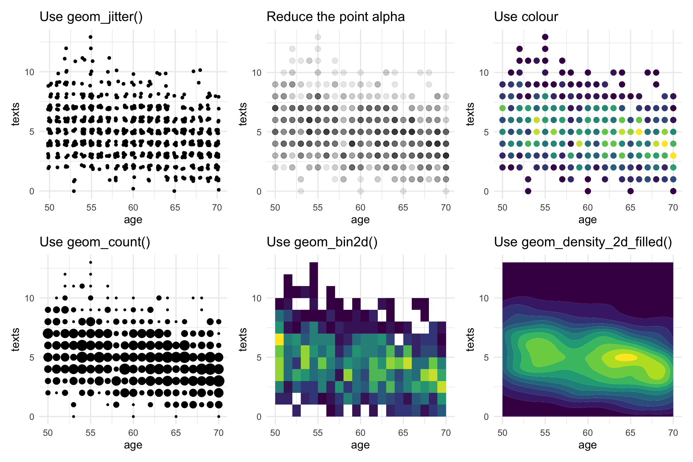
Now I can add the marginal distributions with ggExtra and tidy up the plot a bit. I decided to use geom_count() first, but then realised that the marginal distribution plots looked wrong because the marginal histograms were counting the number of plotted points per bin, not the number of data points. So I ended up using a combination of geom_density_2d_filled() and geom_point() with a low alpha. The marginal plots don’t work unless you have some version of geom_point() (although you could set the alpha to 0 to make it invisible).
Code
p1 <-ggplot(dat, aes(age, texts)) +geom_density_2d_filled(alpha =0.7) +scale_fill_grey() +geom_point(alpha =0.1) +geom_smooth(method = lm, formula = y~x, color ="black") +coord_cartesian(xlim = age_limit, ylim = texts_limit) +scale_y_continuous(breaks =seq(0, 20, 2)) +labs(x ="Age (in years)",y ="Number of texts sent per day",title = titles[1]) +theme(legend.position ="none")age_texts <-ggMarginal(p1, type ="histogram", binwidth =1, xparams =list(fill = age_col),yparams =list(fill = texts_col, boundary =0))age_texts
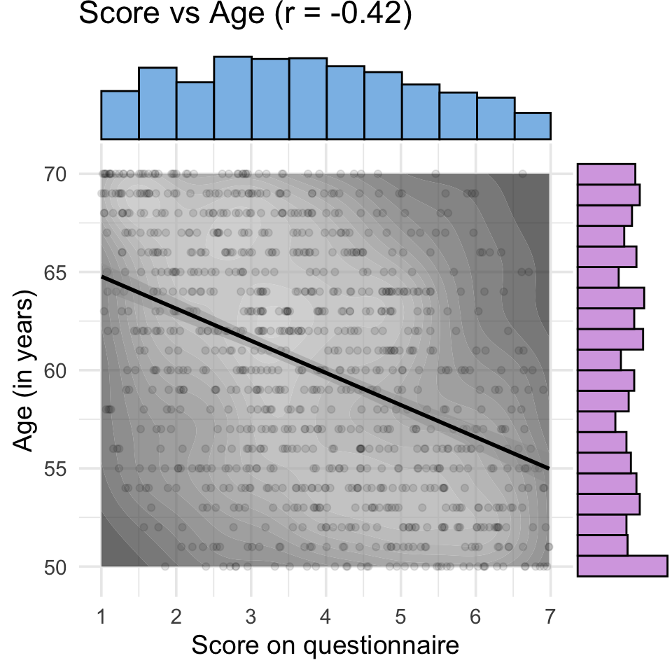
15.3.2 Score vs Age
Code
p2 <-ggplot(dat, aes(score, age)) +geom_density_2d_filled(alpha =0.7) +scale_fill_grey() +geom_point(alpha =0.1) +geom_smooth(method = lm, formula = y~x, color ="black") +scale_x_continuous(breaks =1:7) +coord_cartesian(xlim = score_limit, ylim = age_limit) +labs(y ="Age (in years)",x ="Score on questionnaire",title = titles[2]) +theme(legend.position ="none")score_age <-ggMarginal(p2, type ="histogram", xparams =list(binwidth =0.5, fill = score_col),yparams =list(binwidth =1, fill = age_col))score_age
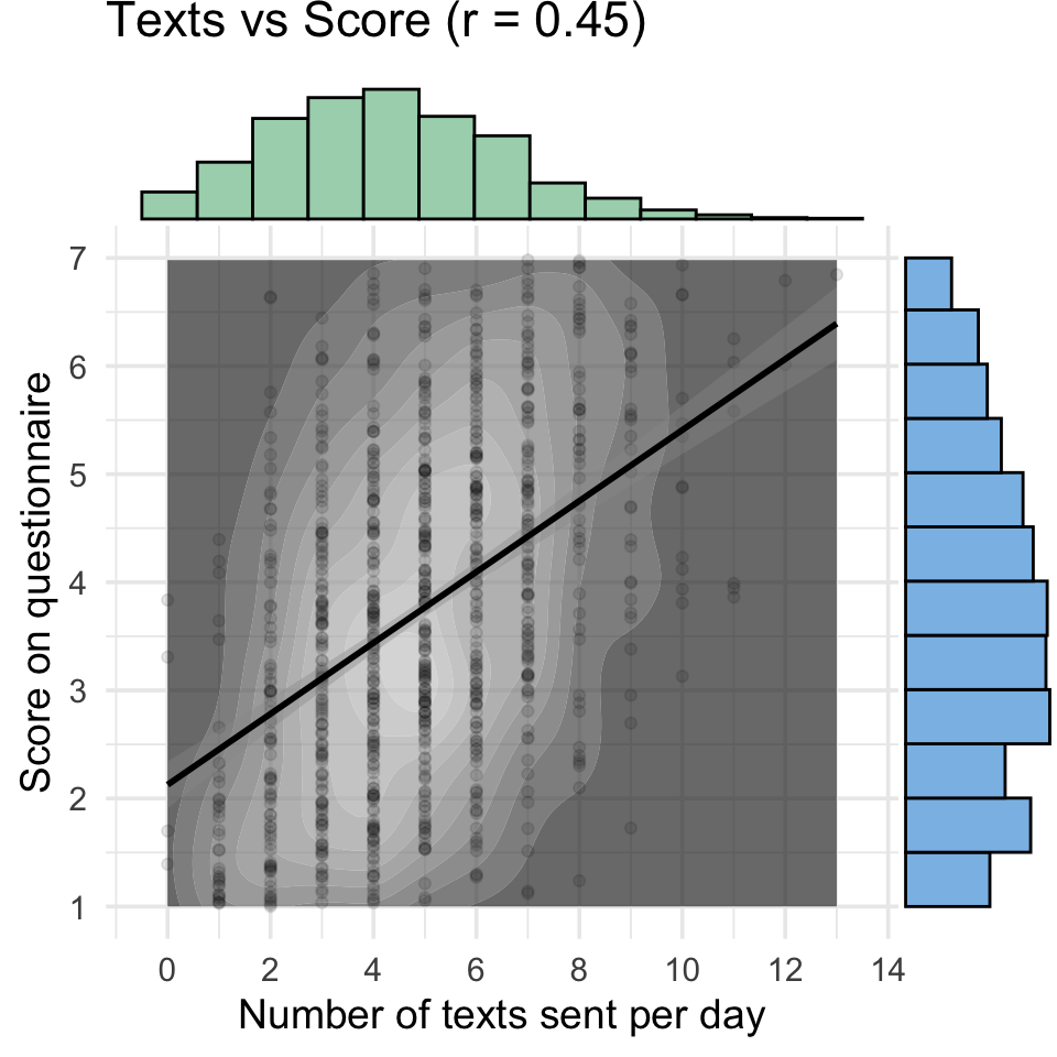
15.3.3 Texts vs Score
Code
p3 <-ggplot(dat, aes(texts, score)) +geom_density_2d_filled(alpha =0.7) +scale_fill_grey() +geom_point(alpha =0.1) +geom_smooth(method = lm, formula = y~x, color ="black") +scale_x_continuous(breaks =seq(0, 20, 2)) +scale_y_continuous(breaks =1:7) +coord_cartesian(xlim = texts_limit, ylim = score_limit ) +labs(x ="Number of texts sent per day",y ="Score on questionnaire",title = titles[3]) +theme(legend.position ="none")texts_score <-ggMarginal(p3, type ="histogram", xparams =list(binwidth =1, fill = texts_col),yparams =list(binwidth =0.5, fill = score_col))texts_score
15.4 Combine
You can’t combine plots with margins made by ggExtra using patchwork, so I have to save each to a file individually and combine them with webmorphR.
WebmorphR is an R package I’m developing for making visual stimuli for research in a way that is computationally reproducible. It uses magick under the hood, but has a lot of convenient functions for making figures.
Code
# read in images starting with mv_imgs <- webmorphR::read_stim("images", "^mv_\\d")# plot in a single rowfig <-plot(imgs, nrow =1)fig
PLots showing multivariate correlations among non-normally distributed variables.
Save the figure to a file.
Code
write_stim(fig, dir ="images", names ="day15", format ="png")