22 Animation
I’ve already done an animated time series for Day 6, so I thought I’d try to get more familiar with gganimate.
22.1 Data
I got all the original data just browsing Our World in Data.
- Happiness: World Happiness Report 2021
- Working Hours: original data from Huberman & Minns, 2007, PWT 9.1, 2019
- Population: original data from United Nations
Load original data
# https://ourworldindata.org/happiness-and-life-satisfaction
happy <- read_csv("data/happiness-cantril-ladder.csv",
                  show_col_types = FALSE) %>%
  rename(happy = 4)

# https://ourworldindata.org/working-hours
work <- read_csv("data/annual-working-hours-per-worker.csv",
                  show_col_types = FALSE)%>%
  rename(work = 4)

# https://ourworldindata.org/world-population-growth
pop <- read_csv("data/population-by-broad-age-group.csv",
                  show_col_types = FALSE) %>%
  pivot_longer(cols = 4:8) %>%
  group_by(Entity, Code, Year) %>%
  summarise(pop = sum(value),
            .groups = "drop")

continent <- countrycode::codelist %>%
  select(Code = iso3c, continent) %>%
drop_na()22.2 Plot
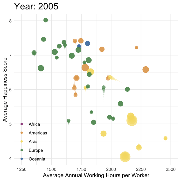
y first step in making an animated plot is always to filter down to one frame of data and get the plot looking like I want.
Code
data %>%
  filter(Year == 2017) %>%
  ggplot(aes(x = work, y = happy, size = pop, color = continent)) +
  geom_point(alpha = 0.9) +
  scale_size(range = c(3, 12), guide = "none") +
  scale_color_manual(values = c("#983E82", "#E2A458", "#F5DC70", "#59935B", "#467AAC"
  )) +
  coord_cartesian(xlim = c(1250, 2500), ylim = c(4, 8)) +
  labs(x = "Average Annual Working Hours per Worker",
       y = "Average Happiness Score",
       color = NULL,
       title = "Year: 2017") +
  theme(legend.position = c(.11, .17),
        plot.title = element_text(size = 18))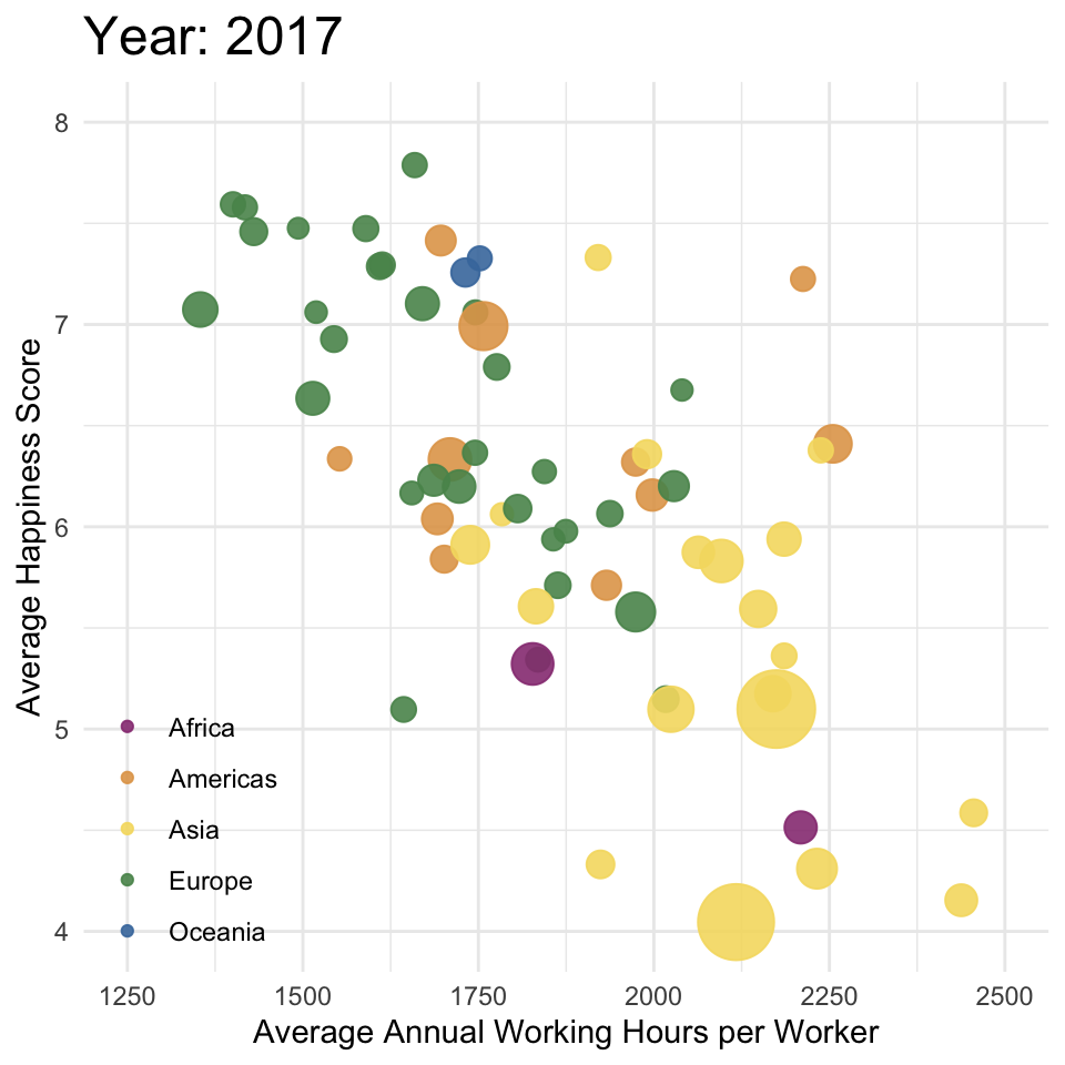
22.3 Animate
The next step is to remove the filter and add the animation functions. I animated by year with transition_time(Year) and changed the title in labs() to “Year: {floor(frame_time)}” because the animation introduced fractional years.
I used this tutorial for datanovia to figure out the shadow_wake().
Code
anim <- data %>%
  ggplot(aes(x = work, y = happy, size = pop, color = continent)) +
  geom_point(alpha = 0.9) +
  scale_size(range = c(3, 12), guide = "none") +
  scale_color_manual(values = c("#983E82", "#E2A458", "#F5DC70", "#59935B", "#467AAC"
  )) +
  coord_cartesian(xlim = c(1250, 2500), ylim = c(4, 8)) +
  labs(x = "Average Annual Working Hours per Worker",
       y = "Average Happiness Score",
       color = NULL,
       title = "Year: {floor(frame_time)}") +
  theme(legend.position = c(.11, .17),
        plot.title = element_text(size = 18)) +
  transition_time(Year) +
  shadow_wake(wake_length = 0.1)
The animating takes awhile, so I always save to a file and set this chunk to not evaluate in the script.
I’m still not entirely convinced of the utility of animated plots, but they do look cool!