12  The Economist

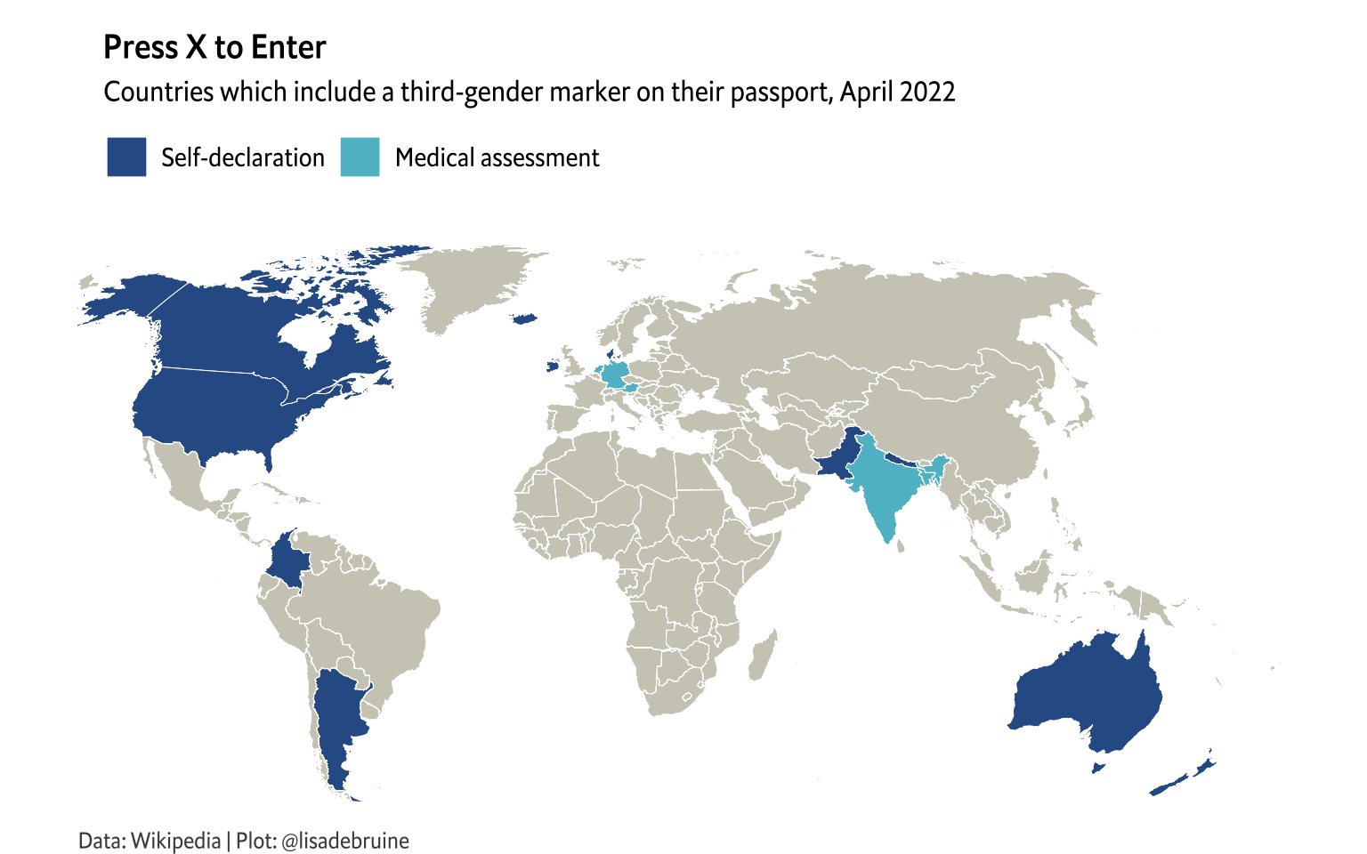
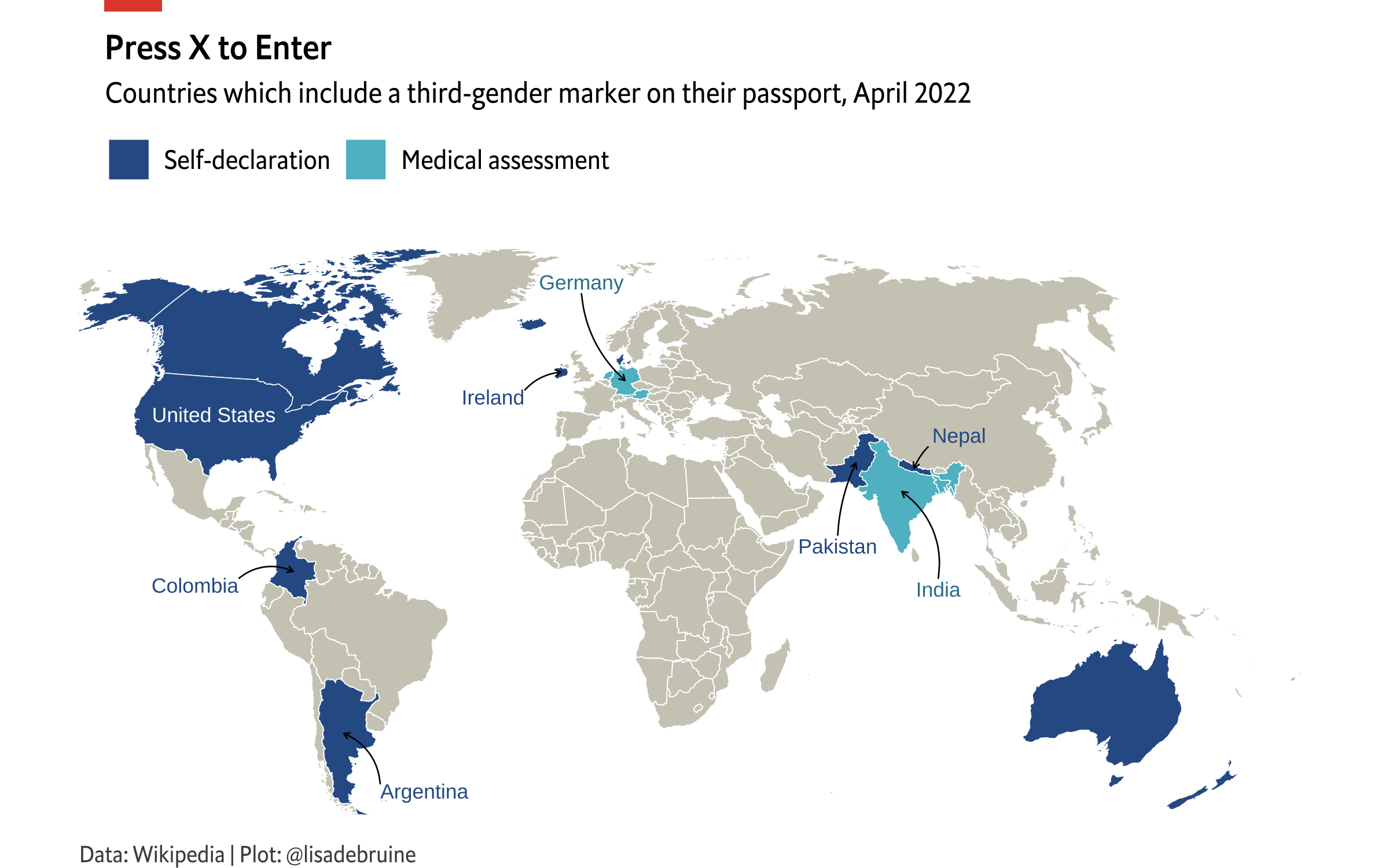
I hadn’t realised The Economist do a daily chart. They range from the simple and powerful to really complex visualisations. I won’t show any here, as their website/blog licensing of a single chart for 1 month to an academic costs £159, but you can see the map I’m going to recreate here: Which countries offer gender-neutral passports?

Setup
library(tidyverse)     # for data wrangling and visualisation
library(sf)            # for maps
library(rnaturalearth) # for map coordinates
library(ggthemes)      # for map theme
library(lwgeom)        # for map projection
library(showtext)      # for adding fonts
library(magick)        # for adding a red rectangle to the top of the plot

12.1 Data

They don’t give a data source beyond “Press reports; The Economist”, but there aren’t that many countries, so I can just create the data table myself, with the help of Wikipedia’s article on legal recognition of non-binary gender. I also added the year that the first non-gendered passport was issued.

Code
nb_passports <- tribble(
  ~country, ~restriction, ~year,
  "Argentina", "Self-declaration", 2021,
  "Australia", "Self-declaration", 2003,
  "Canada", "Self-declaration", 2017,
  "Colombia", "Self-declaration", 2022,
  "Denmark", "Self-declaration", 2014,
  "Ireland", "Self-declaration", 2015, # unclear if X or just gender change introduced then
  "Iceland", "Self-declaration", 2020,
  "Nepal", "Self-declaration", 2007,
  "New Zealand", "Self-declaration", 2012,
  "Pakistan", "Self-declaration", 2017,
  "United States of America", "Self-declaration", 2021,
  "Malta", "Self-declaration", 2017,
  #"Taiwan", "Medical assessment", 2020, # planned, not confirmed https://en.wikipedia.org/wiki/Intersex_rights_in_Taiwan
  "India", "Medical assessment", 2005,
  "Bangladesh", "Medical assessment", 2001,
  "Germany", "Medical assessment", 2019,
  "Austria", "Medical assessment", 2018,
  "Netherlands", "Medical assessment", 2018
) %>%
  mutate(restriction = factor(restriction, c("Self-declaration", "Medical assessment")))

12.2 Map Setup

I’ll use the code from Day 6 to make the map.

Wintri projection
# translate the coordinate reference system
crs <- "+proj=wintri"  # winkel tripel projection
world_wintri <- ne_countries(returnclass = "sf", scale = "medium") %>%
  lwgeom::st_transform_proj(crs = crs)

# translate and crop coordinates
trans_coords <- st_sfc(
  st_point(c(-1.4e7, -6.5e6)), # lower left lat and lon
  st_point(c(2e7, 1e7)),       # upper right lat and lon
  crs = crs) %>%
  st_transform(crs = crs) %>%
  st_coordinates()

crop_coords <- coord_sf(
  datum = NULL, 
  xlim = trans_coords[,'X'], 
  ylim = trans_coords[,'Y'], 
  expand = FALSE)

Add the data

Code
data_map <- left_join(world_wintri, nb_passports, 
                          by = c("geounit" = "country")) %>%
  select(country = geounit, restriction, year, geometry)

12.3 Map in Economist theme

I found the Econ Sans Cnd font that matched The Economist plots. You can use Arial Narrow if you can’t find this one.

Code
font_add(family = "EconSans",
         regular = "fonts/econsanscndreg-webfont.woff.ttf",
         bold = "fonts/econsanscndmed-webfont.woff.ttf")
showtext_auto()

Now build the plot without annotations and try to match the theme.

Code
base_map <- ggplot(data_map) + 
  geom_sf(size = 0.5/.pt,
          fill = "#CECCBF",
          color = "white") +
  geom_sf(mapping = aes(fill = restriction), 
          size = 0.5/.pt,
          color = "white") +
  crop_coords +
  scale_fill_manual(name = NULL,
                    values = c("#2F5C94", "#5DBDCC"), 
                    na.translate = F) +
  labs(title = "Press X to Enter",
       subtitle = "Countries which include a third-gender marker on their passport, April 2022",
       caption = "Data: Wikipedia | Plot: @lisadebruine") +
  theme_map(base_family = "EconSans", base_size = 12) +
  theme(
    plot.title = element_text(hjust = 0.025, face = "bold"),
    plot.subtitle = element_text(hjust = 0.07),
    plot.margin = unit(c(0.2, 0, 0, 0), "in"),
    legend.position = "top",
    legend.text = element_text(size = 11),
    plot.caption = element_text(hjust = 0, color = "grey30")
  )

base_map

12.4 Get Centroids

Get the centre x- and y- coordinates from each country to plot the annotations.

Code
get_centroid <- function(geounit) {
  data_map %>%
    filter(country == geounit) %>%
    pull(geometry) %>%
    sf::st_centroid() %>%
    `[[`(1) %>%
    unclass()
}

usa <- get_centroid("United States of America")
arg <- get_centroid("Argentina")
col <- get_centroid("Colombia")
nep <- get_centroid("Nepal")
ind <- get_centroid("India")
pak <- get_centroid("Pakistan")
ger <- get_centroid("Germany")
ire <- get_centroid("Ireland")

12.5 Add Annotations

These needed a lot of trial-and-error.

Code
base_map +
  annotate("text", label = "United States", color = "white", 
           hjust = 0.5, vjust = 0.5,
           x = usa[1] + 2e5, y = usa[2] - 5e5, size = 3) +
  annotate("text", label = "Argentina", color = "#2F5C94", 
           hjust = 0, vjust = 1,
           x = arg[1] + 1e6, y = arg[2] - 1.4e6, size = 3) +
  annotate(geom = "curve", curvature = 0.3, size = 0.25,
            x = arg[1] + 1e6, y = arg[2] - 1.4e6, 
            xend = arg[1], yend = arg[2],
            arrow = arrow(length = unit(0.2, "lines"))) +
  annotate("text", label = "Colombia", color = "#2F5C94", 
           hjust = 1, vjust = 1,
           x = col[1] - 1.5e6, y = col[2] - 2e5, size = 3) +
  annotate(geom = "curve", curvature = -0.3, size = 0.25,
            x = col[1] - 1.5e6, y = col[2] - 2e5, 
            xend = col[1], yend = col[2],
            arrow = arrow(length = unit(0.2, "lines"))) +
  annotate("text", label = "Nepal", color = "#2F5C94",
           hjust = 0, vjust = 0,
           x = nep[1] + 5e5, y = nep[2] + 7e5, size = 3) +
  annotate(geom = "curve", curvature = 0.1, size = 0.25,
            x = nep[1] + 4e5, y = nep[2] + 6e5, 
            xend = nep[1], yend = nep[2],
            arrow = arrow(length = unit(0.2, "lines"))) +
  annotate("text", label = "India", color = "#35809B",
           hjust = 0.5, vjust = 1,
           x = ind[1] + 1e6, y = ind[2] - 2.5e6, size = 3) +
  annotate(geom = "curve", curvature = 0.3, size = 0.25,
            x = ind[1] + 1e6, y = ind[2] - 2.4e6, 
            xend = ind[1], yend = ind[2],
            arrow = arrow(length = unit(0.2, "lines"))) +
  annotate("text", label = "Pakistan", color = "#2F5C94",
           hjust = 0.5, vjust = 1,
           x = pak[1] - 5e5, y = pak[2] - 2.1e6, size = 3) +
  annotate(geom = "curve", curvature = -0.1, size = 0.25,
            x = pak[1] - 5e5, y = pak[2] - 2e6, 
            xend = pak[1], yend = pak[2],
            arrow = arrow(length = unit(0.2, "lines"))) +
  annotate("text", label = "Germany", color = "#35809B",
           hjust = 0.5, vjust = 0,
           x = ger[1] - 1.2e6, y = ger[2] + 2.5e6, size = 3) +
  annotate(geom = "curve", curvature = 0.2, size = 0.25,
            x = ger[1] - 1.2e6, y = ger[2] + 2.4e6, 
            xend = ger[1], yend = ger[2],
            arrow = arrow(length = unit(0.2, "lines"))) +
  annotate("text", label = "Ireland", color = "#2F5C94",
           hjust = 1, vjust = 1,
           x = ire[1] - 1e6, y = ire[2] - 5e5, size = 3) +
  annotate(geom = "curve", curvature = -0.2, size = 0.25,
            x = ire[1] - 1e6, y = ire[2] - 5e5, 
            xend = ire[1], yend = ire[2],
            arrow = arrow(length = unit(0.2, "lines")))

I tried do this with a new data table containing each country’s label, plus values for the text’s color, hjust, vjust, x, y, and the curve’s curvature, x, y, xend, and yend. However, you can’t set curvature in the mapping, so I had to sort that with pmap().

Code
annotations <- tribble(
  ~label, ~color, ~hjust, ~vjust, ~x, ~y, ~text_x, ~text_y, ~curvature, ~curve_x, ~curve_y,
  "United States", "white", 0.5, 0.5, usa[1], usa[2], +2e5, -5e5, NA, NA, NA,
  "Argentina", "#2F5C94", 0, 1, arg[1], arg[2], 1e6, -1.4e6, 0.3, 1e6, -1.4e6,
  "Colombia", "#2F5C94", 1, 1, col[1], col[2], -1.5e6, -2e5, -0.3, -1.5e6, -2e5,
  "Nepal", "#2F5C94", 0, 0, nep[1], nep[2], 5e5, 7e5, 0.1, 4e5, 6e5, 
  "India", "#35809B", 0.5, 1, ind[1], ind[2], 1e6, -2.5e6, 0.3, 1e6, -2.4e6, 
  "Pakistan", "#2F5C94", 0.5, 1, pak[1], pak[2], -5e5, -2.1e6, -0.1, -5e5, -2e6, 
  "Germany", "#35809B", 0.5, 0, ger[1], ger[2], -1.2e6, 2.5e6, 0.2, -1.2e6, 2.4e6,
  "Ireland", "#2F5C94", 1, 1, ire[1], ire[2], -1e6, -5e5, -0.2, -1e6, -5e5
)

curves <- annotations %>%
  filter(label != "United States") %>%
  pmap(function(label, color, hjust, vjust, 
                 x, y, text_x, text_y, 
                 curvature, curve_x, curve_y) {
    annotate(geom = "curve", 
             x = x + curve_x, 
             y = y + curve_y, 
             xend = x, 
             yend = y, 
             curvature = curvature, 
             size = 0.3, 
             arrow = arrow(length = unit(0.2, "lines")))
  })


base_map +
  geom_text(data = annotations, 
            mapping = aes(label = label, 
            color = I(color),
            hjust = hjust,
            vjust = vjust,
            x = x + text_x,
            y = y + text_y),
            size = 3) +
  curves

Countries which include a third-gender marker on their passport, April 2022 USA, Canada, Colombia, Argentina, Germany, Austria, Netherlands, Denmark, Ireland, Malta, Iceland, Austria, Australia, New Zealand, India, Bangladesh, Pakistan, Nepal

12.6 Add red rectangle

Last, we need to add the classic red rectangle to the top left of the plot. Save the plot as a PNG, then add the red rectangle using magick.

Code
ggsave("images/day12.png", width = 8, height = 5, device = png, bg = "white")
Code
chart <- image_read("images/day12.png")
rect <- image_blank(100, 20, "#D9352C")
img <- image_composite(chart, rect, offset = "+180+0")
image_write(img, "images/day12.png")
Code
knitr::include_graphics("images/day12.png")

Countries which include a third-gender marker on their passport, April 2022 USA, Canada, Colombia, Argentina, Germany, Austria, Netherlands, Denmark, Ireland, Malta, Iceland, Austria, Australia, New Zealand, India, Bangladesh, Pakistan, Nepal. Plot is in the visual style of plots from The Economist.