19 Global Change
Much of the data over time about climate change has a scale problem. Things are pretty stable for quite a long period of time, and then there is a huge jump in the rate of change over the past 100 years. This makes things hard to plot. So today I thought I’d explore the ggforce, specifically the facet_zoom() function for zooming in on a particular part of a plot.
19.1 Data
The data come from a paper by Matt Osman and colleagues. The data for their Figure 2 are freely available, but there are two datasets side-by-side on one sheet, so extracting them took a few steps.
The first dataset is global mean surface temperatures (GMST) from 24K years ago to present, in 200-year bins. The second dataset is GMST from 1000 years ago to 50 years in the future, in 10-year bins. They have some overlap, so I’ll get rid of the years -1000 to present in the more coarse dataset.
| Age BP \ Percentile: | 5th | 10th | 20th | 30th | 40th | 50th | 60th | 70th | 80th | 90th | 95th |
|---|---|---|---|---|---|---|---|---|---|---|---|
| -50--40 | 0.300 | 0.357 | 0.430 | 0.469 | 0.499 | 0.535 | 0.568 | 0.598 | 0.633 | 0.670 | 0.698 |
| -40--30 | 0.145 | 0.193 | 0.252 | 0.288 | 0.321 | 0.348 | 0.377 | 0.404 | 0.430 | 0.467 | 0.496 |
| -30--20 | -0.013 | 0.032 | 0.095 | 0.127 | 0.158 | 0.186 | 0.212 | 0.240 | 0.265 | 0.300 | 0.329 |
| -20--10 | -0.061 | -0.014 | 0.047 | 0.080 | 0.114 | 0.138 | 0.164 | 0.189 | 0.218 | 0.252 | 0.280 |
| -10-0 | -0.009 | 0.046 | 0.101 | 0.140 | 0.173 | 0.200 | 0.225 | 0.251 | 0.277 | 0.310 | 0.338 |
| 0-10 | -0.049 | 0.000 | 0.059 | 0.096 | 0.130 | 0.156 | 0.179 | 0.204 | 0.230 | 0.266 | 0.292 |
Cleaning this is tricky. I want to separate on the “-”, but not if it’s the “- for a negative number (who chose this format?!). I get to use a regex lookbehind, which I just learned about!”(?<=0)-” means a dash that is preceded by (but not including) a 0.
19.2 Initial Plot
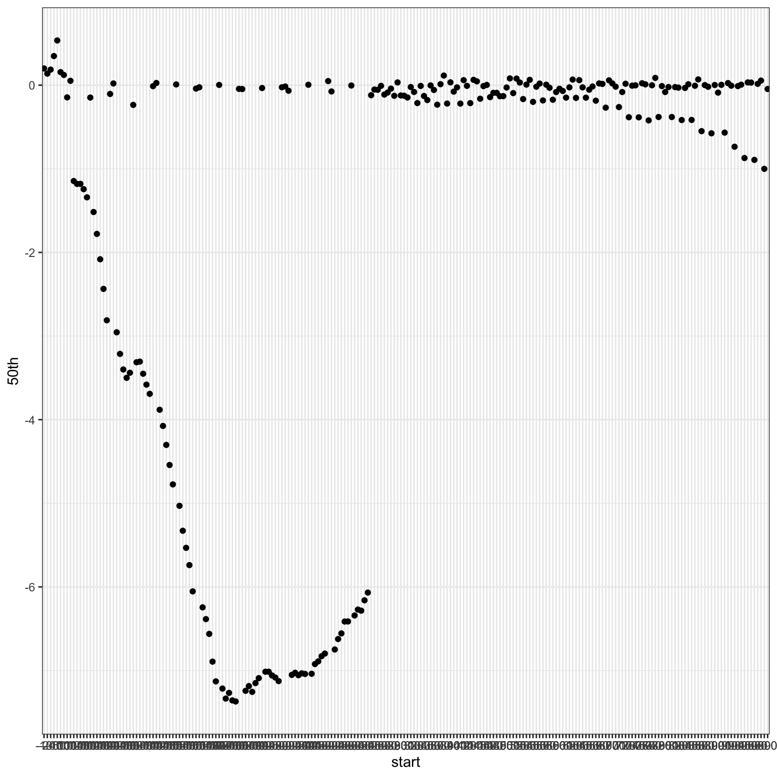
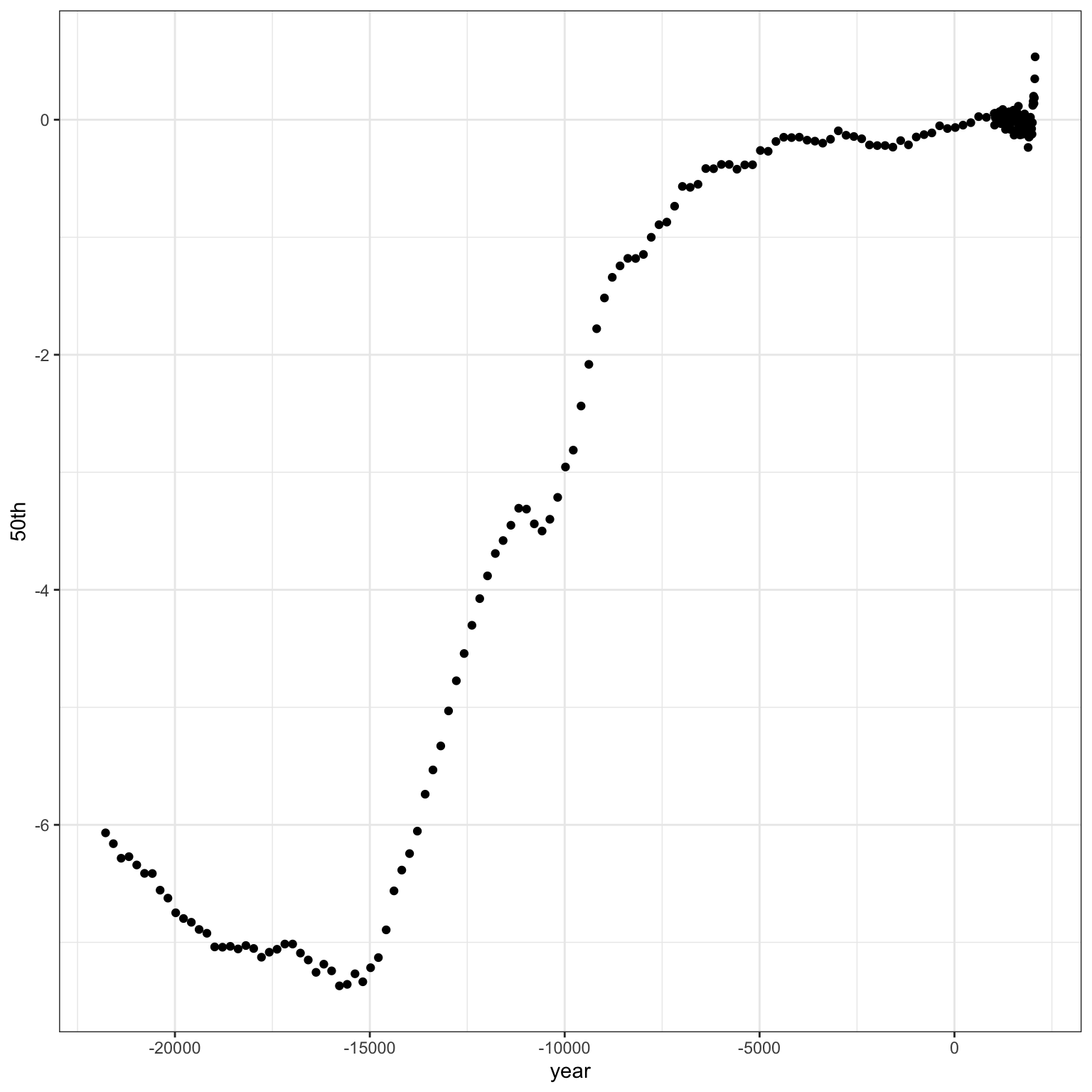
As always, the first plot leaves a bit to be desired. Mainly because I forgot to convert the type of the start and end columns when I split them. It’s a quick fix with type_convert(). I also subtracted the start column from 2020 to calculate the year of each estimate, rather than “years before present”.
19.3 Ribbons
Code
ggplot(dat, aes(x = year, y = `50th`)) +
  geom_ribbon(aes(ymin = `5th`, ymax = `95th`),
              fill = col[1]) +
  geom_ribbon(aes(ymin = `10th`, ymax = `90th`),
              fill = col[2]) +
  geom_ribbon(aes(ymin = `20th`, ymax = `80th`),
              fill = col[3]) +
  geom_ribbon(aes(ymin = `30th`, ymax = `70th`),
              fill = col[4]) +
  geom_ribbon(aes(ymin = `40th`, ymax = `60th`),
              fill = col[5]) +
  geom_line(color = col[6])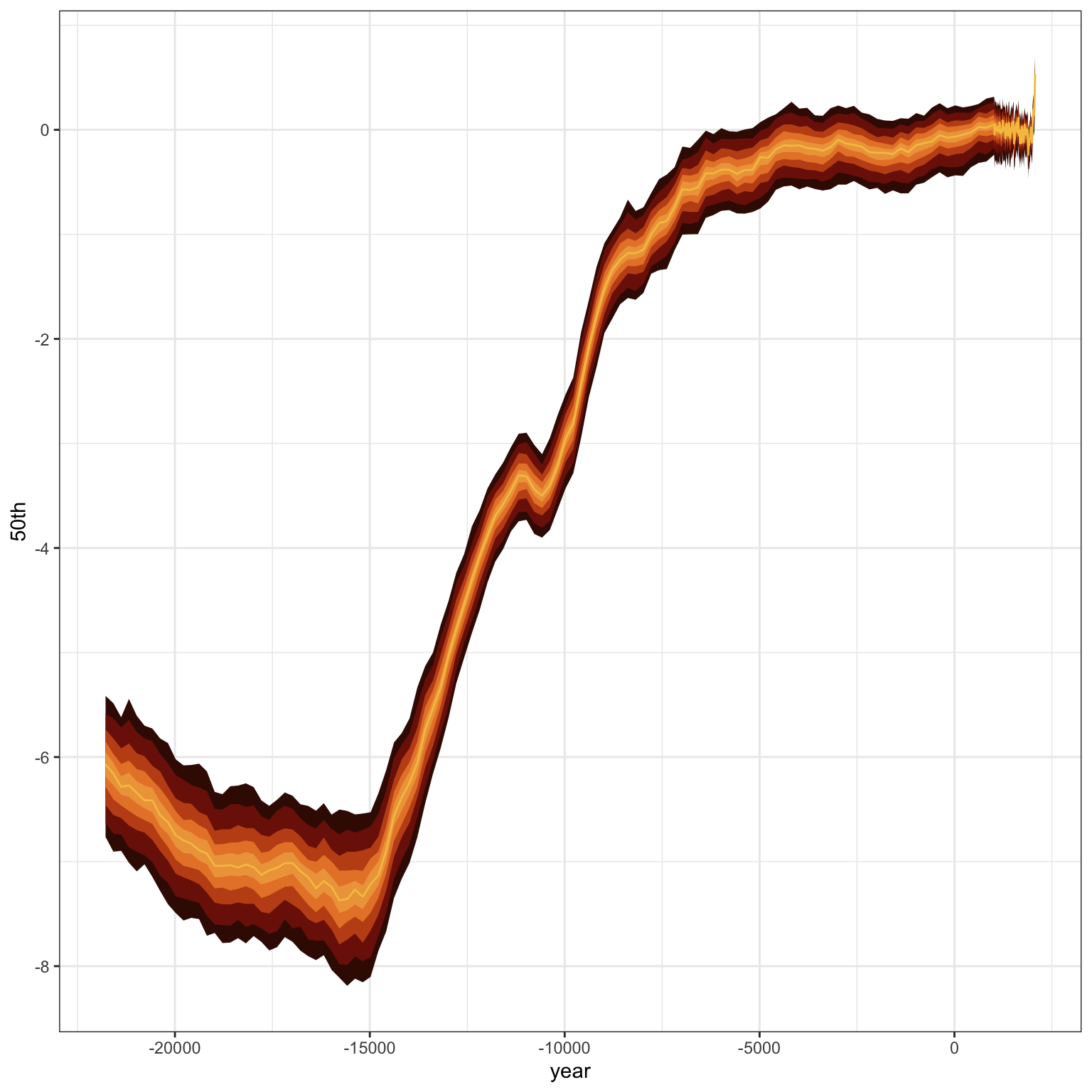
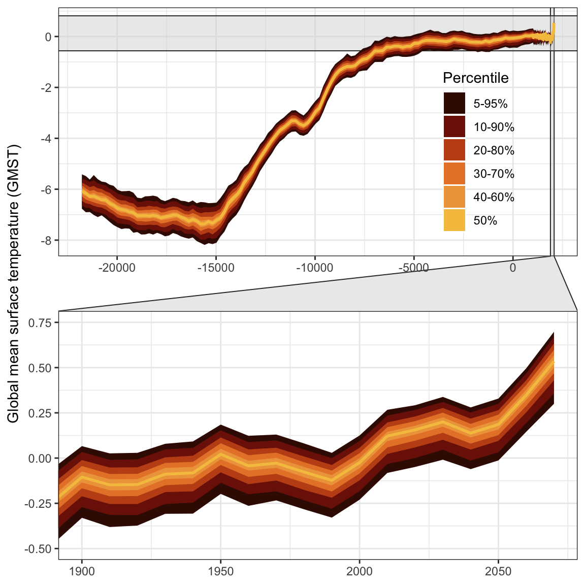
19.4 Facet Zoom
Now I’ll use facet_zoom() from ggforce to highlight the years since 1990. I do wish I could figure out how to specify the two x-axes separately. I’d like the top one to label every 2000 years, and the bottom one every 20.
Code
ggplot(dat, aes(x = year, y = `50th`)) +
  geom_ribbon(aes(ymin = `5th`, ymax = `95th`, fill = col[1])) +
  geom_ribbon(aes(ymin = `10th`, ymax = `90th`, fill = col[2])) +
  geom_ribbon(aes(ymin = `20th`, ymax = `80th`, fill = col[3])) +
  geom_ribbon(aes(ymin = `30th`, ymax = `70th`, fill = col[4])) +
  geom_ribbon(aes(ymin = `40th`, ymax = `60th`, fill = col[5])) +
  geom_ribbon(aes(ymin = `50th`, ymax = `50th`, fill = col[6]), alpha = 0) +
  geom_line(color = col[6], size = 1) +
  scale_fill_identity(name = "Percentile",
                      breaks = unclass(col[1:6]),
                      labels = c("5-95%", "10-90%", "20-80%", "30-70%", "40-60%", "50%"),

                      guide = "legend") +
  #scale_x_continuous(breaks = seq(-24000, 2000, 2000)) +
  facet_zoom(xlim = c(1900, 2070),
             ylim = c(-0.5, 0.75),
             horizontal = FALSE,
             zoom.size = 1) +
  labs(x = NULL, y = "Global mean surface temperature (GMST)\n") +
  theme(legend.position = c(.81, .74),
        legend.background = element_blank())