Munros are the hills in Scotland over 3000 feet high. Many Scottish people are obsessed with Munro bagging — trying to see how many of the 282 Munros you can climb. I’ve lived in Scotland since 2003, but I still haven’t been up a Munro!
So I thought for the mountains prompt, I’d map all of the Munros in Scotland by height. Then someday, when I bag a munro, I can mark it on the map.
Setup
library(tidyverse) # for data wranglinglibrary(sf) # for mapslibrary(rnaturalearth) # for map coordinateslibrary(ggthemes) # for the map themelibrary(plotly) # for interactive plotslibrary(showtext) # for fonts# install a good Scottish font# https://www.fontspace.com/hill-house-font-f40002font_add(family ="Hill House",regular ="fonts/Hill_House.otf")showtext_auto()
8.1 Data
The Database of British and Irish Hills v17.3 has a table of the Munros, with columns for many years (I guess which hills are classified as Munros changes over time). Let’s get just the current munros and fix some of the names.
Code
munros <-read_csv("data/munrotab_v8.0.1.csv",show_col_types =FALSE) %>%filter(`2021`=="MUN") %>%select(-c(`1891`:`2021`)) %>%# get rid of the year columnsrename(height_m ="Height (m)", height_ft ="Height\n(ft)")
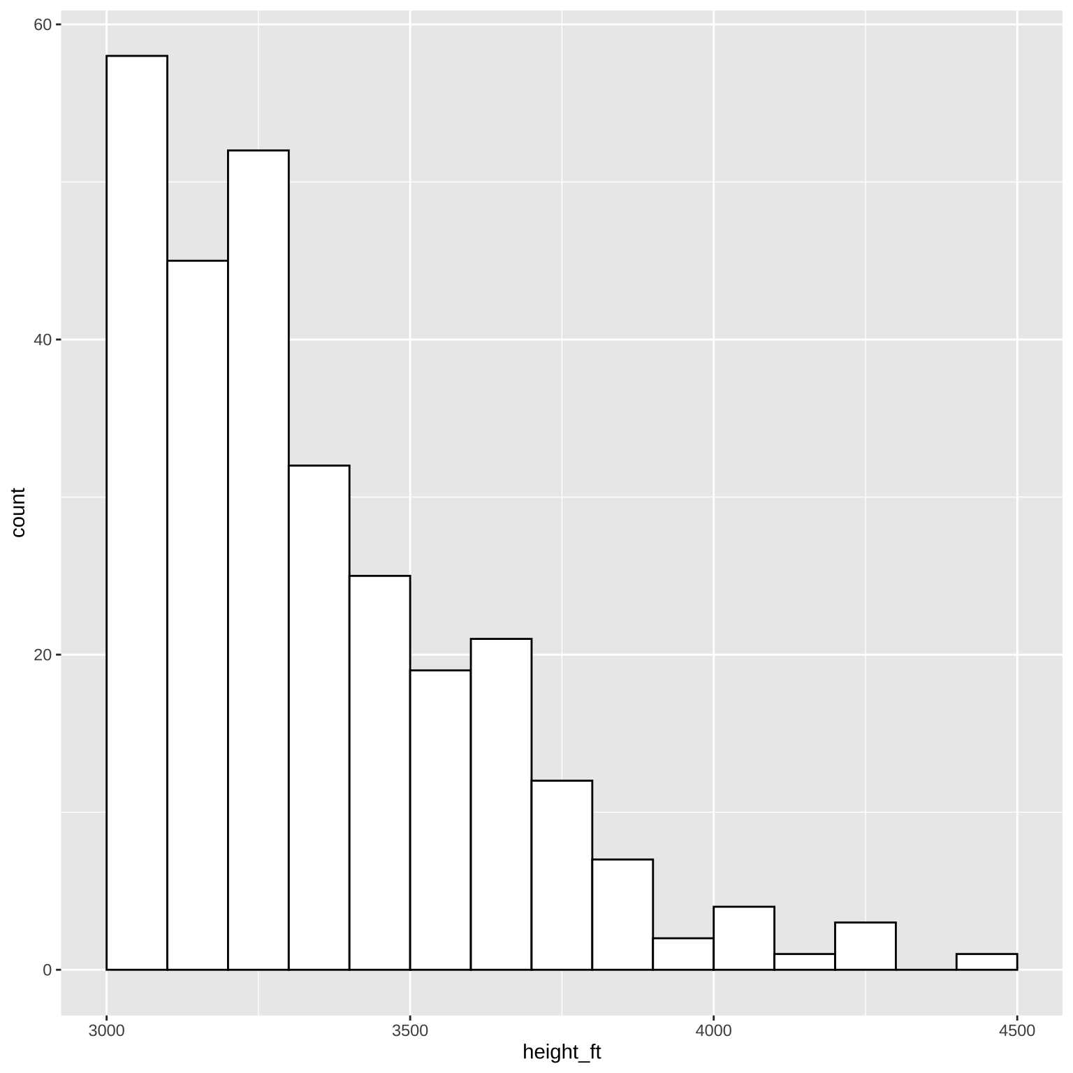
Make a quick histogram of their heights to get an overview of the data. I’d usually use the metric system, but since Munros are defined as hills over 3000 feet, I’ll use feet.
Code
ggplot(munros, aes(x = height_ft)) +geom_histogram(binwidth =100, boundary =0, color ="black", fill ="white")
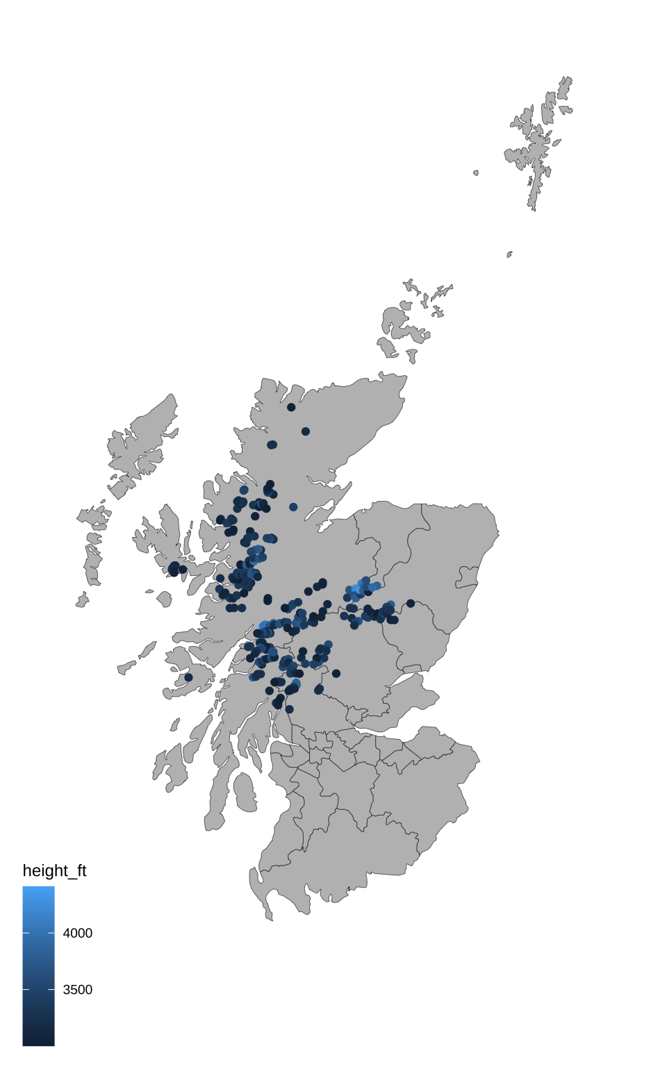
The munro table locates the peaks using grid coordinates, and the map uses latitude and longitude. So I translated the grid coordinates to latitude and longitude using Stackoverflow code from hrbrmstr.
Then plot the latitude and longitude coordinates on the map, colored by height.
Code
ggplot() +geom_sf(data = scotland_sf,mapping =aes(),color ="black", fill ="grey",size = .1) +coord_sf(xlim =c(-8, 0), ylim =c(54, 61)) +geom_point(aes(x = lon, y = lat, color = height_ft), munros) +theme_map()
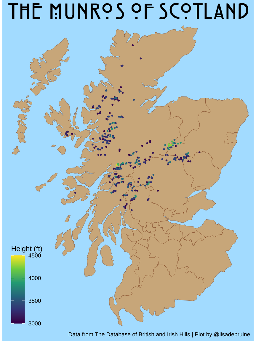
8.3 Make it prettier
There’s no munros on the Northern Isles, so I’ve cropped them out of the map. I also made the colours better. I added a label to geom_point(), which will produce a warning that it isn’t used, but you’ll see why in the next step.
The version of Hill House I have doesn’t have lowercase letters, so I’m using all uppercase for the title.
Code
munro_plot <-ggplot() +geom_sf(data = scotland_sf,mapping =aes(),color ="chocolate4", fill ="tan",size = .1) +coord_sf(xlim =c(-7.4, -2), ylim =c(54.8, 58.5)) +geom_point(aes(label = Name, color = height_ft, y = lat, x = lon), data =arrange(munros, height_ft),size =0.5) +scale_color_viridis_c(name ="Height (ft)",limits =c(3000, 4500)) +labs(x =NULL, y =NULL,title ="THE MUNROS OF SCOTLAND",caption ="Data from The Database of British and Irish Hills | Plot by @lisadebruine") +theme_map() +theme(legend.position =c(0, 0),legend.background =element_blank(),panel.background =element_rect(fill ="transparent", color ="transparent"),plot.background =element_rect(fill ="lightskyblue1", color ="transparent"),plot.title =element_text(family ="Hill House", size =26, hjust = .5) )munro_plot
The location and height of Scotland’s Munros.
8.4 Make it interactive
The plotly package makes it pretty easy to make a ggplot interactive. Select an are to get a closer look, or hover over an individual munro to see why we added the unused label argument to geom_point() above.
I had to add some css to get the hover bar to stop acting weird, but it’s still not quite right.