28 Deviations
The theme of deviation made me think of waterfall plots, which I often find a little confusing, so I thought I’d explore how to make them clearer.
28.1 Data
I’m going to use the same data from Day 27. I just need the date published for each preprint. I’ll use lubridate’s rollback() function to find the first day of the month that each preprint was published, to make it easier to plot by month.
28.2 Plot
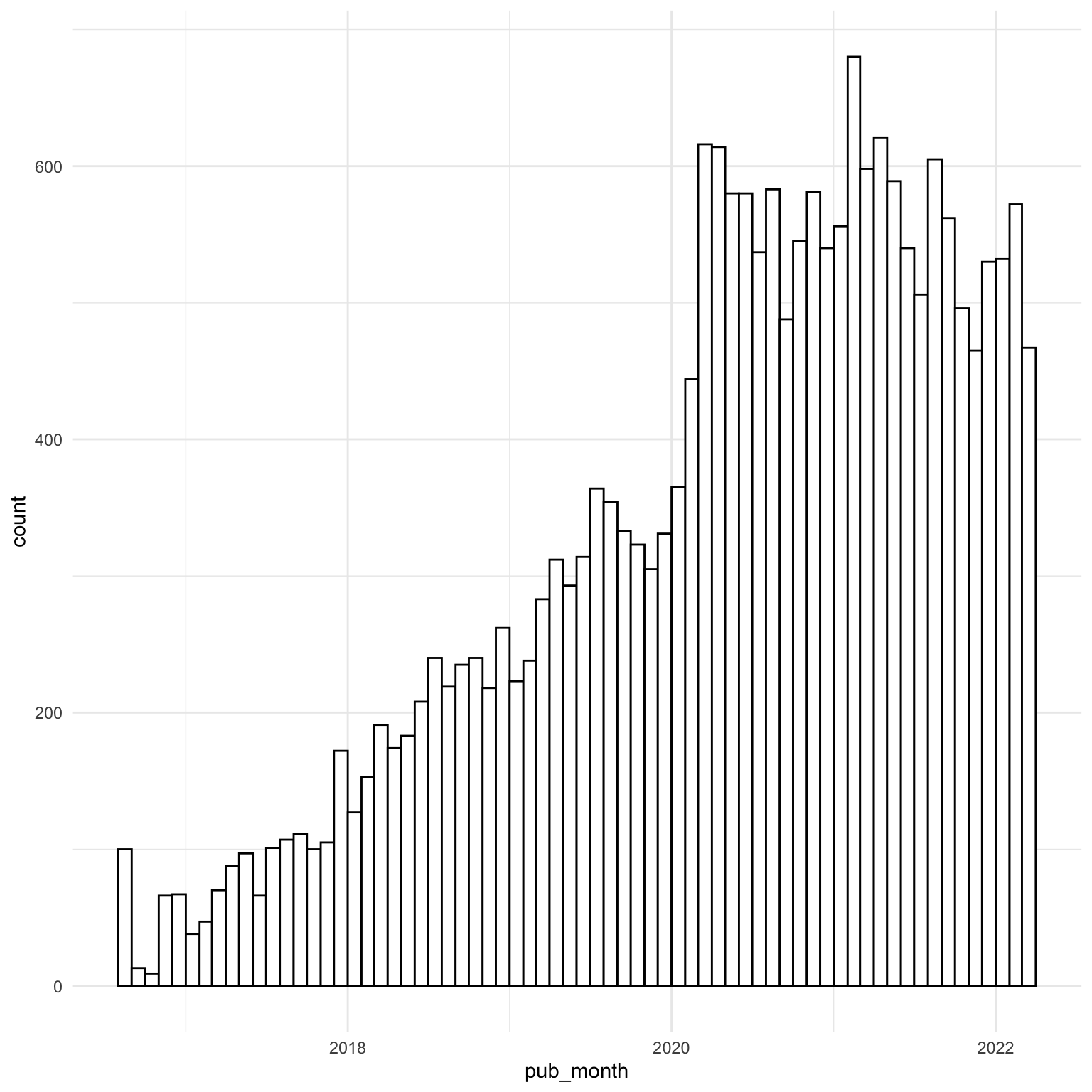
First, I’ll make a histogram to get an idea of what’s going on with the data.
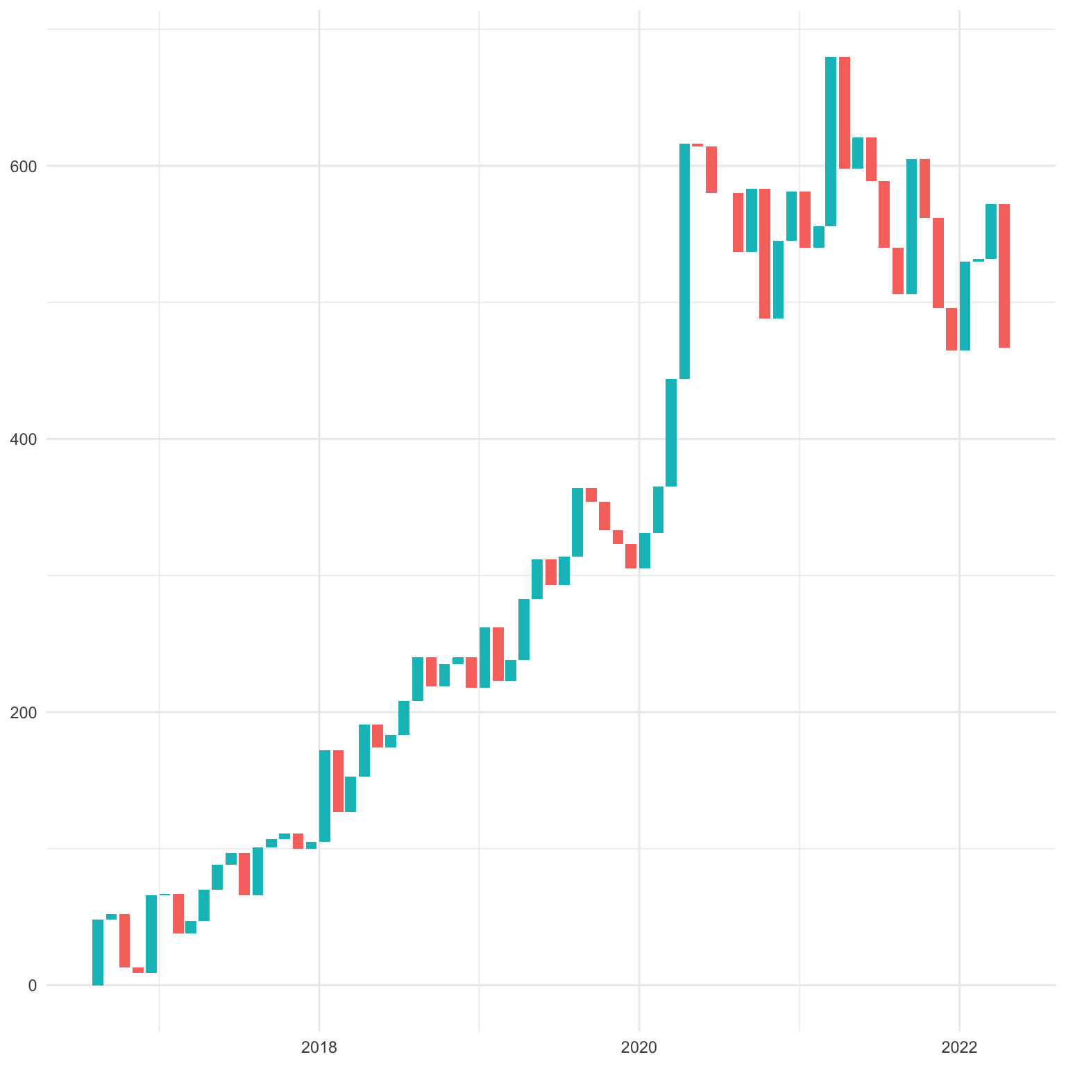
28.3 Waterfall chart
To make a waterfall chart, I need to have a column for the current and previous months’ numbers of publications, and whether the change is an increase or decrease. I’ll use count() to count he number of publications per month and lag() to get the previous month’s n. I’ll alo make columns for the min and max values from n and prev; note the use of pmin() and pmax() to calculate the min and max rowwise instead of columnwise.
Code
| pub_month | n | prev | change | min | max | dir |
|---|---|---|---|---|---|---|
| 2016-08-01 | 48 | 0 | 48 | 0 | 48 | increase |
| 2016-09-01 | 52 | 48 | 4 | 48 | 52 | increase |
| 2016-10-01 | 13 | 52 | -39 | 13 | 52 | decrease |
| 2016-11-01 | 9 | 13 | -4 | 9 | 13 | decrease |
| 2016-12-01 | 66 | 9 | 57 | 9 | 66 | increase |
| 2017-01-01 | 67 | 66 | 1 | 66 | 67 | increase |
I’ll use geom_rect() to make bars that span from pub_month (day 1 of the month) to 25 days later, and from the min to the max values. This looks like a classic waterfall chart, but I think we can do better.
28.4 Arrows
I find it a little confusing to read these charts because I’m not sure if the value for each value on the x-axis is meant to correspond to the top or bottom of the bar. We can fix this by changing the visualisation to geom_segment() and adding an arrow to the line, which will clarify the direction of change and the endpoint for each column.
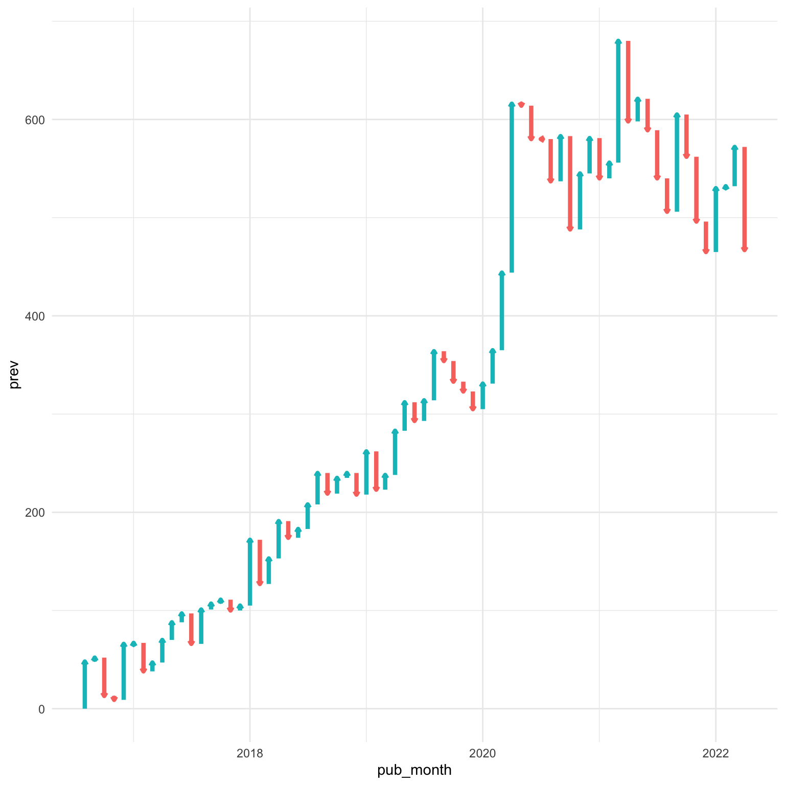
28.5 No change
There’s only one month with no change, and the arrow points sideways, so let’s split the data into nochange and haschange, and use geom_point() to plot nochange. Also, set the lineend and linejoin arguments to geom_segment() to a combo that makes the arrows look good.
Code
nochange <- filter(wf_data, change == 0)
haschange <- filter(wf_data, change != 0)

ggplot(haschange, aes(x = pub_month, xend = pub_month,
                    y = prev, yend = n,
                    color = dir)) +
  geom_segment(show.legend = FALSE, size = 1.5,
               arrow = arrow(length = unit(0.1,"cm")),
               lineend = "round", linejoin = "mitre") +
  geom_point(data = nochange, aes(y = n), size = 2,
             show.legend = FALSE)
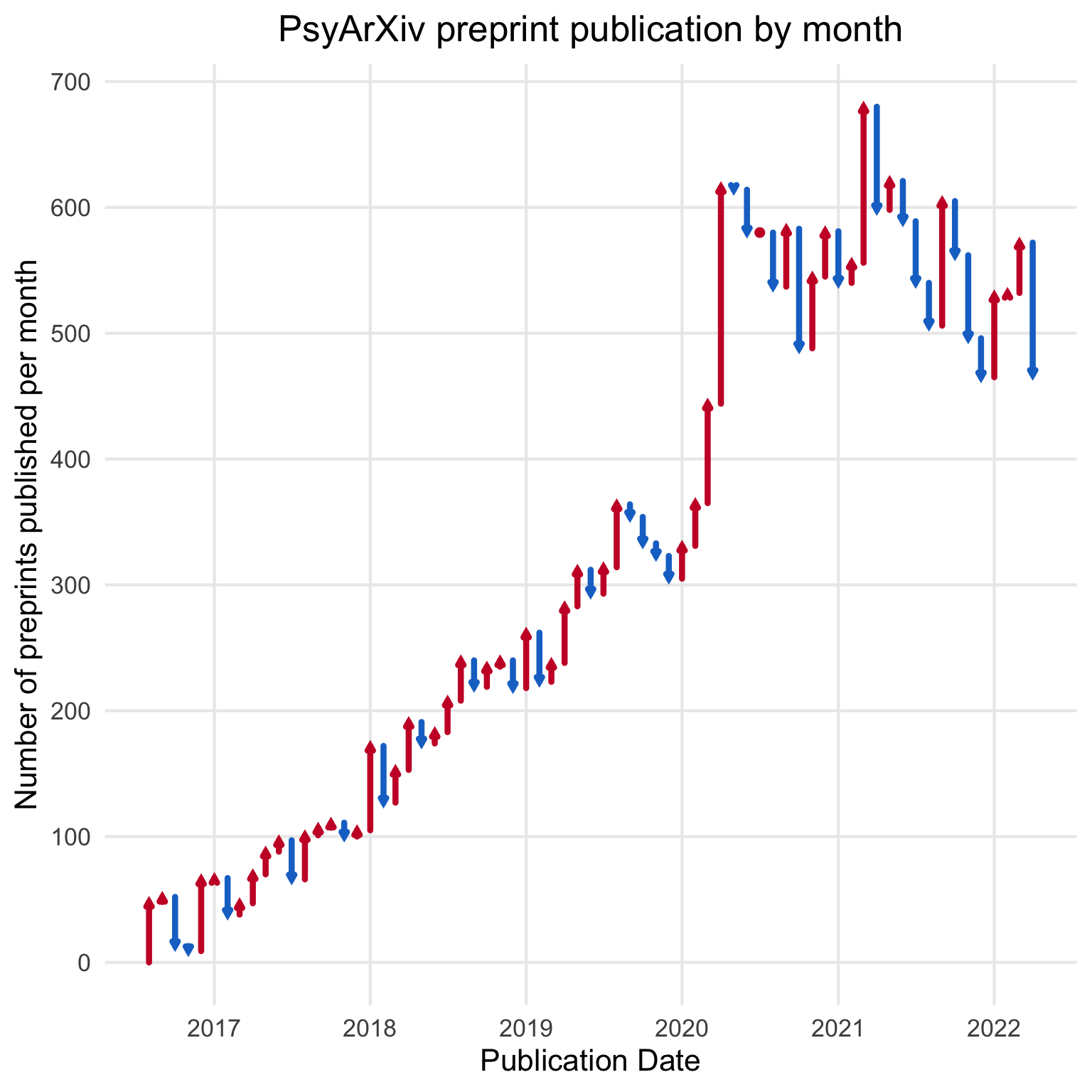
28.6 Final plot
The last step, like always, is to tidy up and style the plot, and add alt text for screen readers.
Code
ggplot(haschange, aes(x = pub_month, xend = pub_month,
                    y = prev, yend = n,
                    color = dir)) +
  geom_segment(show.legend = FALSE, size = 1.5,
               arrow = arrow(length = unit(0.1,"cm")),
               lineend = "round", linejoin = "mitre") +
  geom_point(data = nochange, aes(y = n), color = "#CA1A31", size = 2) +
  scale_x_date("Publication Date",
               date_breaks = "1 year",
               date_labels = "%Y") +
  scale_y_continuous("Number of preprints published per month",
                     breaks = seq(0, 1000, 100)) +
  scale_color_manual(values = c("dodgerblue3", "#CA1A31")) +
  labs(title = "PsyArXiv preprint publication by month") +
  theme_minimal(base_size = 16) +
  theme(panel.grid.minor = element_blank(),
        plot.title = element_text(hjust = 0.5))