11 Circular
I’ve never used coord_polar() before, but it seems pretty good for when you want to show values that vary a lot in magnitude between categories.
11.1 Data
I downloaded the UK sexual orientation data from the Office for National Statistics. It needs a little cleaning first. I’ll leave it wide because I just want to plot the most recent year.
Code
ukso <- read_csv("data/uk_sexual-orientation_8c21318e.csv",
                 skip = 3, n_max = 5,
                 show_col_types = FALSE) %>%
  mutate(`Sexual orientation` = gsub("\n", "", `Sexual orientation`),
         `Sexual orientation` = gsub(" or ", "/", `Sexual orientation`),
         `Sexual orientation` = factor(`Sexual orientation`, `Sexual orientation`))

ukso| Sexual orientation | 2015 | 2016 | 2017 | 2018 | 2019 |
|---|---|---|---|---|---|
| Heterosexual/straight | 95.2 | 95.0 | 95.0 | 94.6 | 93.7 |
| Gay/lesbian | 1.2 | 1.2 | 1.3 | 1.4 | 1.6 |
| Bisexual | 0.7 | 0.8 | 0.8 | 0.9 | 1.1 |
| Other | 0.4 | 0.5 | 0.6 | 0.6 | 0.7 |
| Do not know/refuse | 2.6 | 2.5 | 2.3 | 2.5 | 3.0 |
I wish they’d distinguished “don’t know” and “don’t want to tell you”; they’re two very different things.
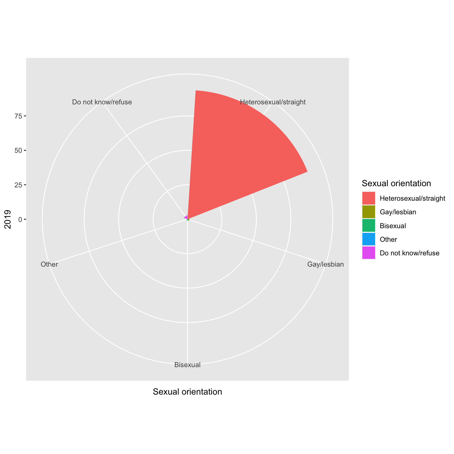
11.2 Simple Polar Plot
My first thought was to just add coord_polar() to a bar plot. Not quite. I kind of hate this plot style, but at least I know how to make one now.
11.3 Polar Y
If you set theta = "y", you get a different type of polar plot.
Code
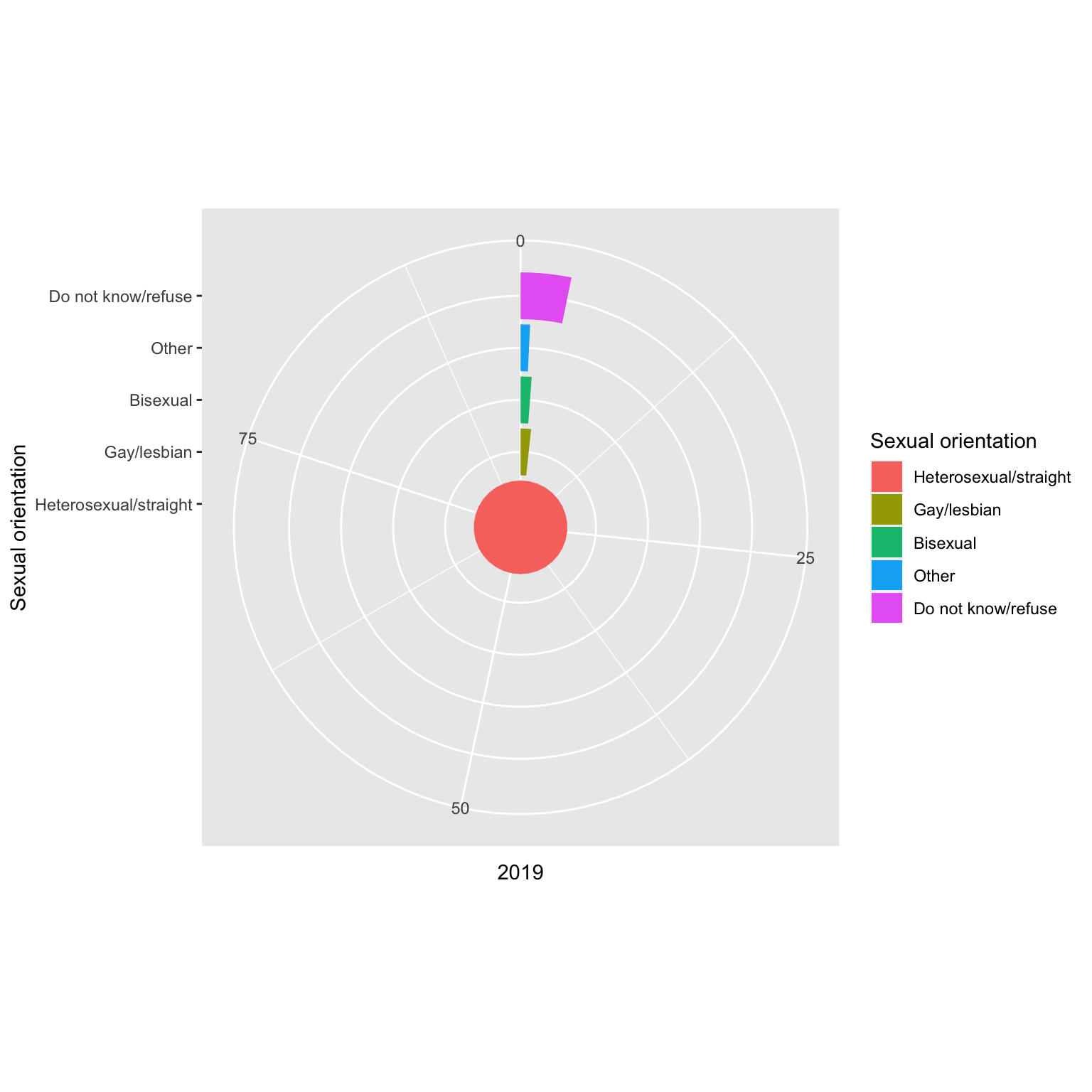
This is closer to what I want, but I’m not keen on the x-axis limit being defined by the largest group and the y-axis needs to go.
11.4 Fix it up
I reversed the order of the categories by setting limits = rev in scale_x_discrete() and made some space in the middle by setting the expand argument to add 3 “columns” of space to the inside.
I added geom_text() to include the exactly values at the end of each bar. I had to use trial and error to get the angles to match. I also used theme() to get rid of the y-axis.
Code
ggplot(ukso, aes(x = `Sexual orientation`,
                 y = `2019`,
                 fill = `Sexual orientation`,
                 color = `Sexual orientation`)) +
  geom_col(width = 1, color = "black") +
  geom_text(aes(label = paste0(`2019`, "%"),
                angle = c(15, -10, -10, -10, -10)),
            size = 3, nudge_y = 0.5, hjust = 0) +
  coord_polar(theta = "y") +
  scale_x_discrete(expand = expansion(add = c(3, 0)), limits = rev) +
  scale_y_continuous(breaks = seq(0, 90, 10),
                     labels = paste0(seq(0, 90, 10), "%"),
                     limits = c(0, 100)) +
  theme(axis.ticks = element_blank(),
        axis.text.y = element_blank(),
        axis.title = element_blank())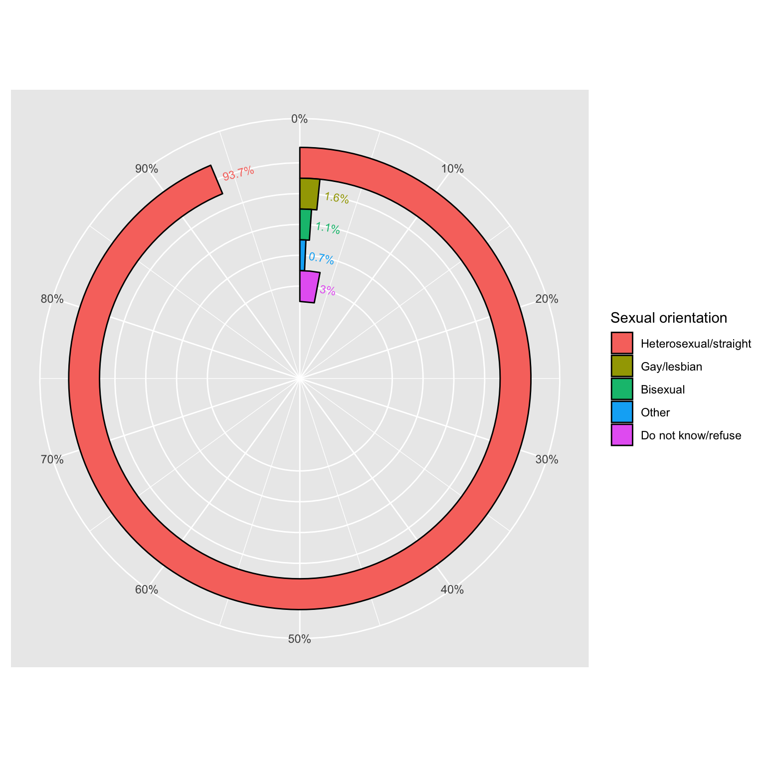
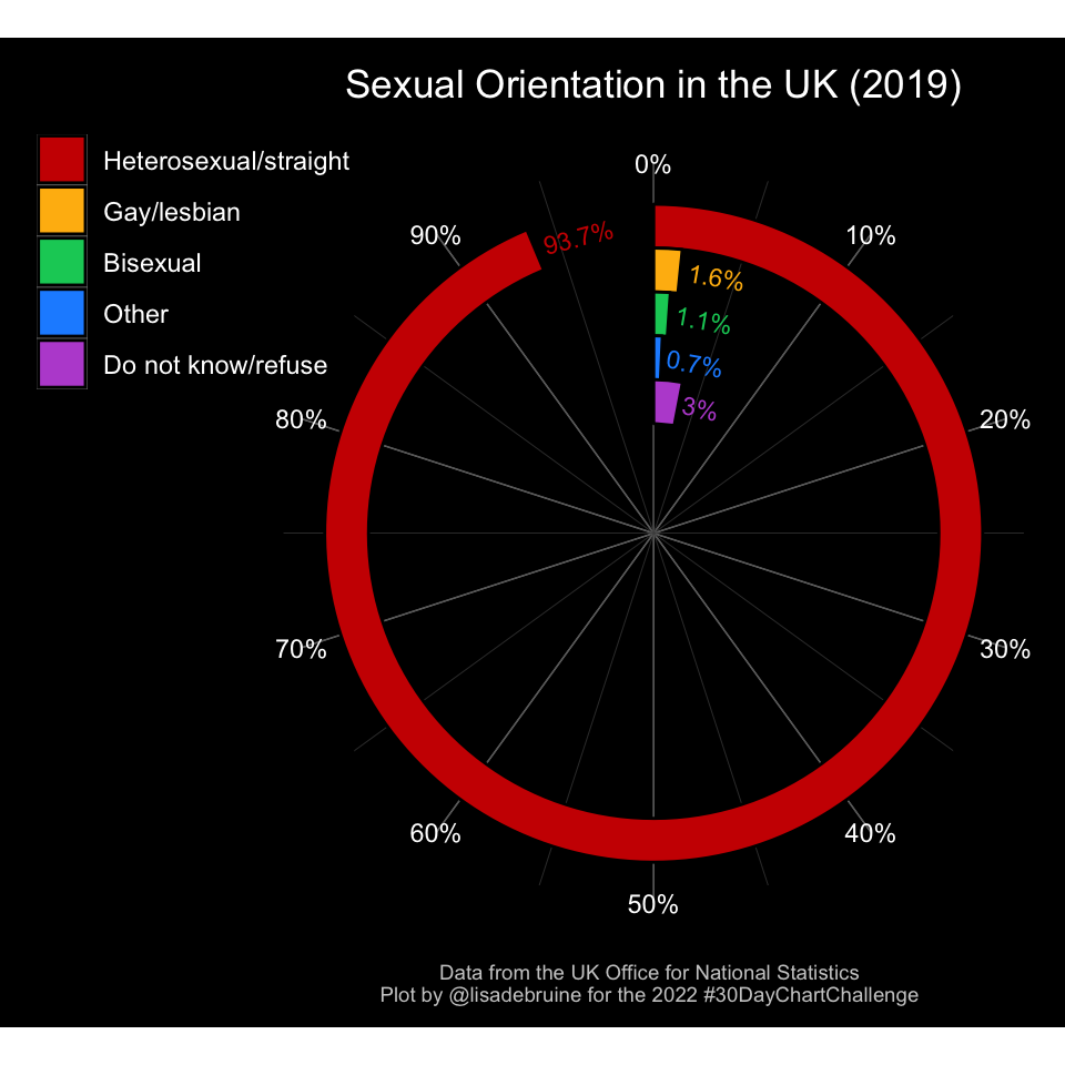
11.5 Theme
Now I’ll really customise the appearance. I found the theme() function intimidating at first, but once you work with it for a bit and get your head around the element_* functions, it’s straightforward and very powerful. I just wish I could figure out how to put the plot caption in the margin like I did for the legend.
Code
rbcol <- c("red3",
           "darkgoldenrod1",
           "springgreen3",
           "dodgerblue",
           "mediumorchid")

ggplot(ukso, aes(x = `Sexual orientation`,
                 y = `2019`,
                 fill = `Sexual orientation`,
                 color = `Sexual orientation`)) +
  geom_col(width = 1, color = "black") +
  geom_text(aes(label = paste0(`2019`, "%"),
                angle = c(15, -10, -10, -10, -10)),
            size = 3, nudge_y = 0.5, hjust = 0) +
  coord_polar(theta = "y") +
  scale_fill_manual(values = rbcol) +
  scale_color_manual(values = rbcol) +
  scale_x_discrete(expand = expansion(add = c(3, 0)), limits = rev) +
  scale_y_continuous(breaks = seq(0, 90, 10),
                     labels = paste0(seq(0, 90, 10), "%"),
                     limits = c(0, 100)) +
  labs(title = "Sexual Orientation in the UK (2019)",
       caption = "Data from the UK Office for National Statistics\nPlot by @lisadebruine for the 2022 #30DayChartChallenge") +
  theme_dark() +
  theme(
    axis.ticks = element_blank(),
    axis.text.y = element_blank(),
    axis.title = element_blank(),
    panel.border = element_blank(),
    panel.grid.major.x = element_blank(),
    panel.grid.major.y = element_line(color = "grey60"),
    panel.grid.minor.y = element_line(color = "grey30"),
    panel.background = element_blank(),
    plot.background = element_rect(fill = "black", color = "transparent"),
    plot.margin = unit(c(.15, 0, 0, 1.1), "in"),
    text = element_text(color = "white"),
    plot.title = element_text(hjust = 0.5),
    axis.text.x = element_text(color = "white"),
    legend.background = element_blank(),
    legend.title = element_blank(),
    legend.position = c(-.06, 0.84),
    plot.caption.position = "plot",
    plot.caption = element_text(color = "grey80", size = 7, hjust = 0.5,
                                margin = margin(b = .1, unit = "in"))
  )